Howler.js是一个不错的HTML5声音引擎。功能强大,性能不错,用起来也很方便。
1. 官网
https://howlerjs.com/ 其代码托管在GitHub上。
2. 兼容性
Howler默认使用Web Audio,但在IE上可以自动转为HTML 5 Audio。这点很是贴心。
3. 声音激活
移动端的Safari和Chrome都禁止网页自动播放声音,必须通过用户的操作,touch, click等触发。Howler可以设置成自动捕捉用户操作激活(解禁)声音播放。
Howler.js是一个不错的HTML5声音引擎。功能强大,性能不错,用起来也很方便。
1. 官网
https://howlerjs.com/ 其代码托管在GitHub上。
2. 兼容性
Howler默认使用Web Audio,但在IE上可以自动转为HTML 5 Audio。这点很是贴心。
3. 声音激活
移动端的Safari和Chrome都禁止网页自动播放声音,必须通过用户的操作,touch, click等触发。Howler可以设置成自动捕捉用户操作激活(解禁)声音播放。
如果只是简单动画,建议使用css3或者animate.css这个库就可以了。
当需要开发复杂交互逻辑,例如问答游戏,打蚊子之类的小游戏,或者一些需要复杂图形/线条变换的页面,可以使用createjs完成。
EASELJS:一个JavaScript库,使HTML5 Canvas标签变得更简单。
用于创建游戏,生成艺术作品,和处理其他高级图形化等有着很友好的体验。(用来方便在页面上绘制元素的)
TWEENJS:TweenJS类库主要用来调整和动画HTML5和Javascript属性, 提供了简单并且强大的tweening接口。(用来做动画效果的)
SOUNDJS:SoundJS提供了简单而强大的API来处理音频。 通过插件来执行实际的音频实现,简单直接的处理声音。(用来控制音频播放的)
PRELOADJS:PreloadJS是一个用来管理和协调相关资源加载的类库, 它可以方便的帮助你预先加载相关资源。(资源预加载)
打开src/index.html 引入createjs和swiperjs(用于实现页面切换)
<script src="libs/js/swiper.min.js"></script>
<script src="libs/js/createjs-2015.11.26.min.js"></script>
<script src="js/main.js"></script>
以下代码是swiper初始化代码,监听onSlideChangeEnd事件,防止页面多次渲染。
var hasSlidePage = [] // 存储已经看过的页面,用于防止页面反复渲染
var mySwiper = new Swiper('.swiper-container', {
  direction: 'vertical',
  pagination: '.swiper-pagination',
  mousewheelControl: true,
  touchRatio: 0.5,
  onSlideChangeEnd: function (swiper) {
    if (hasSlidePage.indexOf(swiper.activeIndex) > -1) {
      return
    }
    hasSlidePage.push(swiper.activeIndex)
    switch (swiper.activeIndex) {
      case 1:
        renderPage2()
    }
  }
})
// 加载资源
function loadAssest() {
  // 加载资源列表
  manifest = [
    { src: "clearLight/blue.png", id: "blue" }
    ... //此处省略
  ]
  // 统计加载进度
  var loadCount = 0
  preload = new createjs.LoadQueue(false, "./images/");
  // 每加载成功一个资源回调一次
  preload.on("fileload", function (event) {
    loadCount++
    document.querySelector("#process").innerHTML = (loadCount * 100 / manifest.length).toFixed(0) + '%'
  })
  // 所有资源加载完毕后的回调
  preload.on('complete', function (event) {
    // 隐藏加载层,显示内容层
    document.querySelector(".loading-cover").style.display = 'none'
    document.querySelector(".swiper-container").style.display = "block"
    // 渲染第一个页面
    renderPage1()
  })
  // 使用preload预加载指定资源
  preload.loadManifest(manifest)
}
第一个页面绘制代码
// 绘制第一页
function renderPage1() {
  // 创建画布
  var canvas = document.getElementById("canvas1")
  var stage = new createjs.Stage(canvas)
  // 由于添加元素后需要手动更新画布,比较麻烦,该防范监听tick事件,进行自动更新
  createjs.Ticker.addEventListener("tick", handleTicker);
  function handleTicker() {
    stage.update();
  }
  // 在画布添加元素
  var title = this.createText(stage, "超浓缩", "normal 80px microsoft yahei", "#fff", 40, 40)
  // 不知道为什么中文不能自动换行,英文是可以的,所以中文用\n进行换行
  var subTitle1 = this.createText(stage, "·科技突破,高能量配方,活性物浓度高达47%,是普通洗衣液\n的三倍以上,获得「浓缩+」洗衣液认证", "normal 24px microsoft yahei", "#fff", 40, 160)
  var subTitle2 = this.createText(stage, "·一泵8g洗8件,小体积,大能量,660g=2.2kg,用量减少\n70%以上", "normal 24px microsoft yahei", "#fff", 40, 240)
  var logo = this.createImage(stage, 'superEnrichment/logo', 116, 83, 320, 60)
  var bigPower = this.createImage(stage, 'big_power', 163, 154, 40, 320)
  var concentration = this.createImage(stage, 'concentration', 230, 154, 250, 320)
  var bottom = this.createImage(stage, 'bottom', 600, 360, 75, 800)
  var waterDrop = this.createImage(stage,'water_drop', 300, 350, 223, 600)
  var light_line_long = this.createImage(stage,'light_line_long', 23, 300, 110, 670)
  var light_line_long2 = this.createImage(stage,'light_line_long', 23, 300, 365, 810)
  var light_line_long3 = this.createImage(stage,'light_line_long', 23, 300, 620, 670)

  // 对元素设置淡出动画
  createjs.Tween.get(title).to({ alpha: 1 }, 300)
  createjs.Tween.get(subTitle1).to({ alpha: 1 }, 300)
  createjs.Tween.get(subTitle2).to({ alpha: 1 }, 300)
  createjs.Tween.get(logo).to({ alpha: 1 }, 300)
  createjs.Tween.get(bigPower).to({ alpha: 1 }, 300)
  createjs.Tween.get(concentration).to({ alpha: 1 }, 300)
  createjs.Tween.get(waterDrop).to({ alpha: 1 }, 300)
  createjs.Tween.get(waterDrop, { loop: true }).to({ y: 570 }, 1000, createjs.Ease.getPowInOut(2)).to({ y: 600 }, 1000, createjs.Ease.getPowInOut(2))
  createjs.Tween.get(bottom).to({ alpha: 1 }, 300)
  createjs.Tween.get(light_line_long, { loop: true }).to({ alpha: 1 }, 1000).to({ alpha: 0.4 }, 1000)
  createjs.Tween.get(light_line_long2, { loop: true }).to({ alpha: 1 }, 1000).to({ alpha: 0.4 }, 1000)
  createjs.Tween.get(light_line_long3, { loop: true }).to({ alpha: 1 }, 1000).to({ alpha: 0.4 }, 1000)
}
<script src="easeljs-0.7.1.min.js"></script>  //引入相关的js文件
<canvas id="canvas"></canvas>

var canvas = document.querySelector('#canvas');
//创建舞台
var stage = new createjs.Stage(canvas);
//创建一个Shape对象,此处也可以创建文字Text,创建图片Bitmap
var rect = new createjs.Shape();
//用画笔设置颜色,调用方法画矩形,矩形参数:x,y,w,h
rect.graphics.beginFill("#f00").drawRect(0, 0, 100, 100);
//添加到舞台
stage.addChild(rect);
//刷新舞台
stage.update();
graphics可以设置一些样式,线条宽度,颜色等等,也可以调用一些方法绘制图形,比如矩形drawRect,圆形drawCircle等等,具体可以自己查看api。
createjs.Ticker.setFPS(60);
stage.setChildIndex(red,1);
var contain = new createjs.Container();
contain.addChild(bgImg);
contain.addChild(bitmap);
stage.addChild(contain);
蹬蹬蹬~本篇文章的重点,绘制图像并对图像进行处理
var bg = new createjs.Bitmap("./background.png");
stage.addChild(bg);
stage.update();
按照上面的EaselJS的正常的绘制流程来说,上面这段代码应该可以正常显示。但是,只是有些情况下可以正常显示的,这个图像资源需要确定加载成功后才可以new,否则不会有图像在画布上,如果有做资源预加载,可以直接使用上面的代码,如果没有,则需要在image加载完成onload之后才进行绘制
var img = new Image();
img.src = './img/linkgame_pass@2x.png';
img.onload = function () {
 var bg = new createjs.Bitmap("./background.png");
 stage.addChild(bg);
 stage.update();
}
仅仅绘制图片是不够的,createjs提供了几种处理图片的方法:
stage = new createjs.Stage("gameView");
bg = new createjs.Bitmap("./img/linkgame_pass@2x.png");
bg.x = 10;
bg.y = 10;
//遮罩图形
shape = new createjs.Shape();
shape.graphics.beginFill("#000").drawCircle(0, 0, 100);
shape.x = 200;
shape.y = 100;
bg.mask = shape;     //给图片bg添加遮罩
stage.addChild(shape);
stage.addChild(bg);
stage.update();
var blur = new createjs.BlurFilter(5,5,1);
bg.filters = [blur];
bg.cache(0,0,bg.image.width,bg.image.height);
6.3 使用Rectangle剪裁图片
使用EaselJS内置的Rectangle对象来创建一个选取框,显示图片的某各部分。
stage = new createjs.Stage("gameView");
bg = new createjs.Bitmap("./img/linkgame_pass@2x.png");
bg.x = 10;
bg.y = 10;
var rect = new createjs.Rectangle(0, 0, 121, 171);
bg.sourceRect = rect;
stage.addChild(bg);
stage.update();
easeljs事件默认是不支持touch设备的,需要以下代码才支持:
createjs.Touch.enable(stage);
对于Bitmap,Shape等对象,都可以直接使用addEventListener进行事件监听
bitmap = new createjs.Bitmap('');
bitmap.addEventListener(‘click’,handle);
createjs.Ticker.timingMode = createjs.Ticker.RAF;
<canvas id="game" width="750" height="700"></canvas>
注意,以上代码的width,height不同于css中的width,height。
比如,你在canvas内部绘制图片,用x,y轴进行定位,这里的x,y是相对于canvas这个整体。
我们再把canvas当成一整张图片使用css进行适配
canvas{
     width: 100%;
}
那么,就会有以下的效果,canvas会适配屏幕尺寸,里面的图片也会等比例变大变小。
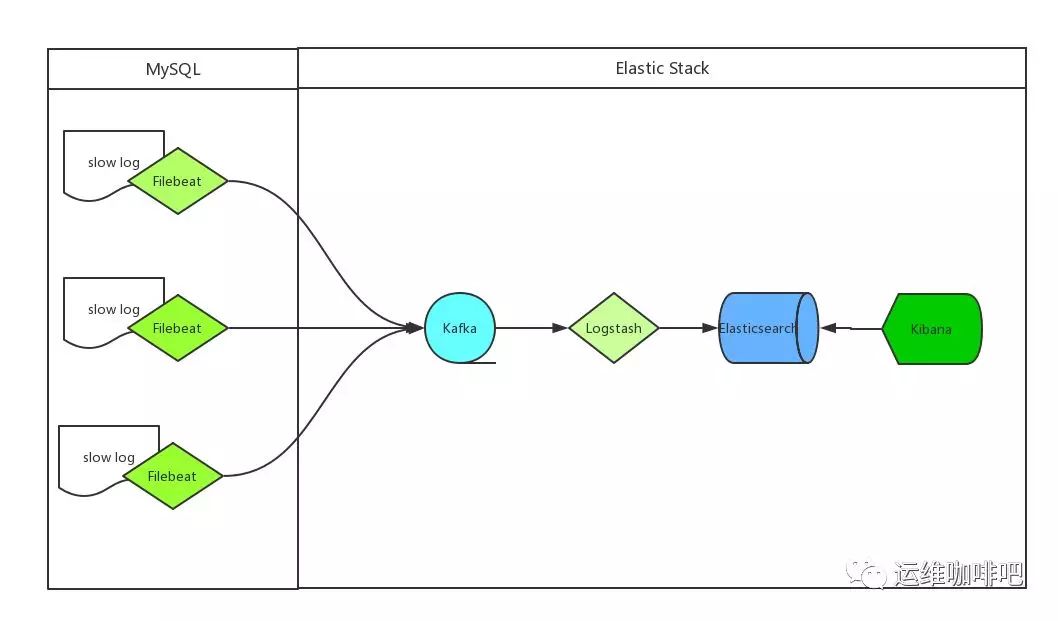
ELK 最早是 Elasticsearch(以下简称ES)、Logstash、Kibana 三款开源软件的简称,三款软件后来被同一公司收购,并加入了Xpark、Beats等组件,改名为Elastic Stack,成为现在最流行的开源日志解决方案,虽然有了新名字但大家依然喜欢叫她ELK,现在所说的ELK就指的是基于这些开源软件构建的日志系统。
我们收集mysql慢日志的方案如下:
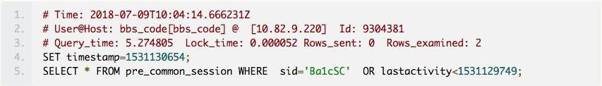
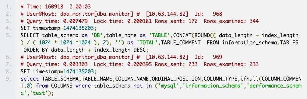
目前主要使用的mysql版本有5.5、5.6 和 5.7,经过仔细对比发现每个版本的慢查询日志都稍有不同,如下:
5.5 版本慢查询日志
5.6 版本慢查询日志
5.7 版本慢查询日志
慢查询日志异同点:
上边我们已经分析了各个版本慢查询语句的构成,接下来我们就要开始收集这些数据了,究竟应该怎么收集呢?
慢日志中同样没有字段记录主机,可以通过filebeat注入字段来解决,例如我们给filebeat的name字段设置为服务器IP,这样最终通过beat.name这个字段就可以确定SQL对应的主机了。
filebeat 完整的配置文件如下:
重要参数解释:
{“@timestamp”:”2018-08-07T09:36:00.140Z”,”beat”:{“hostname”:”db-7eb166d3″,”name”:”10.63.144.71″,”version”:”5.4.0″},”input_type”:”log”,”message”:”# User@Host: select[select] @ [10.63.144.16] Id: 23460596\n# Query_time: 0.155956 Lock_time: 0.000079 Rows_sent: 112 Rows_examined: 366458\nSET timestamp=1533634557;\nSELECT DISTINCT(uid) FROM common_member WHERE hideforum=-1 AND uid != 0;”,”offset”:1753219021,”source”:”/data/slow/mysql_slow.log”,”type”:”log”}
logstash完整的配置文件如下:
grok段根据我们前文对mysql慢日志的分类分别写不通的正则表达式去匹配,当有多条正则表达式存在时,logstash会从上到下依次匹配,匹配到一条后边的则不再匹配。
date字段定义了让SQL中的timestamp_mysql字段作为这条日志的时间字段,kibana上看到的实践排序的数据依赖的就是这个时间
打开Kibana添加 mysql-slowlog-* 的Index,并选择timestamp,创建Index Pattern
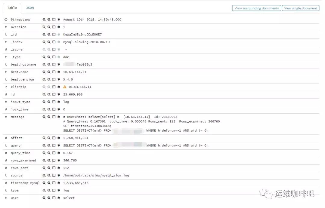
进入Discover页面,可以很直观的看到各个时间点慢日志的数量变化,可以根据左侧Field实现简单过滤,搜索框也方便搜索慢日志,例如我要找查询时间大于2s的慢日志,直接在搜索框输入 query_time: > 2 回车即可。
点击每一条日志起边的很色箭头能查看具体某一条日志的详情。
如果你想做个大盘统计慢日志的整体情况,例如top 10 SQL等,也可以很方便的通过web界面配置。

一、概述
SVG 是一种基于 XML 语法的图像格式,全称是可缩放矢量图(Scalable Vector Graphics)。其他图像格式都是基于像素处理的,SVG 则是属于对图像的形状描述,所以它本质上是文本文件,体积较小,且不管放大多少倍都不会失真。

SVG 文件可以直接插入网页,成为 DOM 的一部分,然后用 JavaScript 和 CSS 进行操作。
<!DOCTYPE html>
<html>
<head></head>
<body>

<svg id="mysvg" xmlns="http://www.w3.org/2000/svg" viewBox="0 0 800 600" preserveAspectRatio="xMidYMid meet">
    <circle id="mycircle" cx="400" cy="300" r="50"/>
    </svg>

</body>
</html>
上面是 SVG 代码直接插入网页的例子。
SVG 代码也可以写在一个独立文件中,然后用<img>、<object>、<embed>、<iframe>等标签插入网页。
<img src="circle.svg">
<object id="object" data="circle.svg" type="image/svg+xml"></object>
<embed id="embed" src="icon.svg" type="image/svg+xml">
<iframe id="iframe" src="icon.svg"></iframe>
CSS 也可以使用 SVG 文件。
.logo {
background: url(icon.svg);
}
SVG 文件还可以转为 BASE64 编码,然后作为 Data URI 写入网页。
<img src=”data:image/svg+xml;base64,[data]”>
二、语法
2.1<svg>标签
SVG 代码都放在顶层标签<svg>之中。下面是一个例子。
<svg width=“100%” height=“100%”>
<circle id=“mycircle” cx=“50” cy=“50” r=“50” />
</svg>
<svg>的width属性和height属性,指定了 SVG 图像在 HTML 元素中所占据的宽度和高度。除了相对单位,也可以采用绝对单位(单位:像素)。如果不指定这两个属性,SVG 图像默认大小是300像素(宽) x 150像素(高)。
如果只想展示 SVG 图像的一部分,就要指定viewBox属性。
<svg width=“100” height=“100” viewBox=“50 50 50 50″>
<circle id=“mycircle” cx=“50” cy=“50” r=“50” />
</svg>
<viewBox>属性的值有四个数字,分别是左上角的横坐标和纵坐标、视口的宽度和高度。上面代码中,SVG 图像是100像素宽 x 100像素高,viewBox属性指定视口从(50, 50)这个点开始。所以,实际看到的是右下角的四分之一圆。
注意,视口必须适配所在的空间。上面代码中,视口的大小是 50 x 50,由于 SVG 图像的大小是 100 x 100,所以视口会放大去适配 SVG 图像的大小,即放大了四倍。
如果不指定width属性和height属性,只指定viewBox属性,则相当于只给定 SVG 图像的长宽比。这时,SVG 图像的默认大小将等于所在的 HTML 元素的大小。
2.2 <circle>标签
<circle>标签代表圆形。
<svg width=“300” height=“180”>
<circle cx=“30” cy=“50” r=“25” />
<circle cx=“90” cy=“50” r=“25” class=“red” />
<circle cx=“150” cy=“50” r=“25” class=“fancy” />
</svg>
上面的代码定义了三个圆。<circle>标签的cx、cy、r属性分别为横坐标、纵坐标和半径,单位为像素。坐标都是相对于<svg>画布的左上角原点。
class属性用来指定对应的 CSS 类。
.red {
fill: red;
}
.fancy {
fill: none;
stroke: black;
stroke-width: 3pt;
}
SVG 的 CSS 属性与网页元素有所不同。
2.3 <line>标签
<line>标签用来绘制直线。
<svg width=“300” height=“180”>
<line x1=“0” y1=“0” x2=“200” y2=“0” style=“stroke:rgb(0,0,0);stroke-width:5″ />
</svg>
上面代码中,<line>标签的x1属性和y1属性,表示线段起点的横坐标和纵坐标;x2属性和y2属性,表示线段终点的横坐标和纵坐标;style属性表示线段的样式。
2.4 <polyline>标签
<polyline>标签用于绘制一根折线。
<svg width=“300” height=“180”>
<polyline points=“3,3 30,28 3,53″ fill=“none” stroke=“black” />
</svg>
<polyline>的points属性指定了每个端点的坐标,横坐标与纵坐标之间与逗号分隔,点与点之间用空格分隔。
2.5 <rect>标签
<rect>标签用于绘制矩形。
<svg width=“300” height=“180”>
<rect x=“0” y=“0” height=“100” width=“200” style=“stroke: #70d5dd; fill: #dd524b” />
</svg>
<rect>的x属性和y属性,指定了矩形左上角端点的横坐标和纵坐标;width属性和height属性指定了矩形的宽度和高度(单位像素)。
2.6 <ellipse>标签
<ellipse>标签用于绘制椭圆。
<svg width=“300” height=“180”>
<ellipse cx=“60” cy=“60” ry=“40” rx=“20” stroke=“black” stroke–width=“5” fill=“silver”/>
</svg>
<ellipse>的cx属性和cy属性,指定了椭圆中心的横坐标和纵坐标(单位像素);rx属性和ry属性,指定了椭圆横向轴和纵向轴的半径(单位像素)。
2.7 <polygon>标签
<polygon>标签用于绘制多边形。
<svg width=“300” height=“180”>
<polygon fill=“green” stroke=“orange” stroke–width=“1” points=“0,0 100,0 100,100 0,100 0,0″/>
</svg>
<polygon>的points属性指定了每个端点的坐标,横坐标与纵坐标之间与逗号分隔,点与点之间用空格分隔。
2.8 <path>标签
<path>标签用于制路径。
<svg width=“300” height=“180”>
<path d=“
M 18,3
L 46,3
L 46,40
L 61,40
L 32,68
L 3,40
L 18,40
Z
“></path>
</svg>
<path>的d属性表示绘制顺序,它的值是一个长字符串,每个字母表示一个绘制动作,后面跟着坐标。
2.9 <text>标签
<text>标签用于绘制文本。
<svg width=“300” height=“180”>
<text x=“50” y=“25”>Hello World</text>
</svg>
<text>的x属性和y属性,表示文本区块基线(baseline)起点的横坐标和纵坐标。文字的样式可以用class或style属性指定。
2.10 <use>标签
<use>标签用于复制一个形状。
<svg viewBox=“0 0 30 10″ xmlns=“http://www.w3.org/2000/svg”>
<circle id=“myCircle” cx=“5” cy=“5” r=“4”/>
<use href=“#myCircle” x=“10” y=“0” fill=“blue” />
<use href=“#myCircle” x=“20” y=“0” fill=“white” stroke=“blue” />
</svg>
<use>的href属性指定所要复制的节点,x属性和y属性是<use>左上角的坐标。另外,还可以指定width和height坐标。
2.11 <g>标签
<g>标签用于将多个形状组成一个组(group),方便复用。
<svg width=“300” height=“100”>
<g id=“myCircle”>
<text x=“25” y=“20”>圆形</text>
<circle cx=“50” cy=“50” r=“20”/>
</g>
<use href=“#myCircle” x=“100” y=“0” fill=“blue” />
<use href=“#myCircle” x=“200” y=“0” fill=“white” stroke=“blue” />
</svg>
2.12 <defs>标签
<defs>标签用于自定义形状,它内部的代码不会显示,仅供引用。
<svg width=“300” height=“100”>
<defs>
<g id=“myCircle”>
<text x=“25” y=“20”>圆形</text>
<circle cx=“50” cy=“50” r=“20”/>
</g>
</defs>
<use href=“#myCircle” x=“0” y=“0” />
<use href=“#myCircle” x=“100” y=“0” fill=“blue” />
<use href=“#myCircle” x=“200” y=“0” fill=“white” stroke=“blue” />
</svg>
2.13 <pattern>标签
<pattern>标签用于自定义一个形状,该形状可以被引用来平铺一个区域。
<svg width=“500” height=“500”>
<defs>
<pattern id=“dots” x=“0” y=“0” width=“100” height=“100” patternUnits=“userSpaceOnUse”>
<circle fill=“#bee9e8″ cx=“50” cy=“50” r=“35” />
</pattern>
</defs>
<rect x=“0” y=“0” width=“100%” height=“100%” fill=“url(#dots)” />
</svg>
上面代码中,<pattern>标签将一个圆形定义为dots模式。patternUnits=”userSpaceOnUse”表示<pattern>的宽度和长度是实际的像素值。然后,指定这个模式去填充下面的矩形。
2.14 <image>标签
<image>标签用于插入图片文件。
<svg viewBox=“0 0 100 100″ width=“100” height=“100”>
<image xlink:href=“path/to/image.jpg”
width=“50%” height=“50%”/>
</svg>
上面代码中,<image>的xlink:href属性表示图像的来源。
2.15 <animate>标签
<animate>标签用于产生动画效果。
<svg width=“500px” height=“500px”>
<rect x=“0” y=“0” width=“100” height=“100” fill=“#feac5e”>
<animate attributeName=“x” from=“0” to=“500” dur=“2s” repeatCount=“indefinite” />
</rect>
</svg>
上面代码中,矩形会不断移动,产生动画效果。
<animate>的属性含义如下。
可以在多个属性上面定义动画。
<animate attributeName=”x” from=”0″ to=”500″ dur=”2s” repeatCount=”indefinite” />
<animate attributeName=”width” to=”500″ dur=”2s” repeatCount=”indefinite” />
2.16 <animateTransform>标签
<animate>标签对 CSS 的transform属性不起作用,如果需要变形,就要使用<animateTransform>标签。
<svg width=“500px” height=“500px”>
<rect x=“250” y=“250” width=“50” height=“50” fill=“#4bc0c8″>
<animateTransform attributeName=“transform” type=“rotate” begin=“0s” dur=“10s” from=“0 200 200″ to=“360 400 400″ repeatCount=“indefinite” />
</rect>
</svg>
上面代码中,<animateTransform>的效果为旋转(rotate),这时from和to属性值有三个数字,第一个数字是角度值,第二个值和第三个值是旋转中心的坐标。from=”0 200 200″表示开始时,角度为0,围绕(200, 200)开始旋转;to=”360 400 400″表示结束时,角度为360,围绕(400, 400)旋转。
三、JavaScript 操作
3.1 DOM 操作
如果 SVG 代码直接写在 HTML 网页之中,它就成为网页 DOM 的一部分,可以直接用 DOM 操作。
<svg
id=“mysvg”
xmlns=“http://www.w3.org/2000/svg”
viewBox=“0 0 800 600″
preserveAspectRatio=“xMidYMid meet”
>
<circle id=“mycircle” cx=“400” cy=“300” r=“50” />
<svg>
上面代码插入网页之后,就可以用 CSS 定制样式。
circle {
stroke-width: 5;
stroke: #f00;
fill: #ff0;
}
circle:hover {
stroke: #090;
fill: #fff;
}
然后,可以用 JavaScript 代码操作 SVG。
var mycircle = document.getElementById(‘mycircle’);
mycircle.addEventListener(‘click’, function(e) {
console.log(‘circle clicked – enlarging’);
mycircle.setAttribute(‘r’, 60);
}, false);
上面代码指定,如果点击图形,就改写circle元素的r属性。
3.2 获取 SVG DOM
使用<object>、<iframe>、<embed>标签插入 SVG 文件,可以获取 SVG DOM。
var svgObject = document.getElementById(‘object’).contentDocument;
var svgIframe = document.getElementById(‘iframe’).contentDocument;
var svgEmbed = document.getElementById(’embed’).getSVGDocument();
注意,如果使用<img>标签插入 SVG 文件,就无法获取 SVG DOM。
3.3 读取 SVG 源码
由于 SVG 文件就是一段 XML 文本,因此可以通过读取 XML 代码的方式,读取 SVG 源码。
<div id=“svg-container”>
<svg
xmlns=“http://www.w3.org/2000/svg”
xmlns:xlink=“http://www.w3.org/1999/xlink”
xml:space=“preserve” width=“500” height=“440”
>
<!– svg code –>
</svg>
</div>
使用XMLSerializer实例的serializeToString()方法,获取 SVG 元素的代码。
var svgString = new XMLSerializer()
.serializeToString(document.querySelector(‘svg’));
3.4 SVG 图像转为 Canvas 图像
首先,需要新建一个Image对象,将 SVG 图像指定到该Image对象的src属性。
var img = new Image();
var svg = new Blob([svgString], {type: “image/svg+xml;charset=utf-8″});
var DOMURL = self.URL || self.webkitURL || self;
var url = DOMURL.createObjectURL(svg);
img.src = url;
然后,当图像加载完成后,再将它绘制到<canvas>元素。
img.onload = function () {
var canvas = document.getElementById(‘canvas’);
var ctx = canvas.getContext(‘2d’);
ctx.drawImage(img, 0, 0);
};
四、实例:折线图
下面将一张数据表格画成折线图。
Date |Amount
—–|——
2014–01–01 | $10
2014–02–01 | $20
2014–03–01 | $40
2014–04–01 | $80
上面的图形,可以画成一个坐标系,Date作为横轴,Amount作为纵轴,四行数据画成一个数据点。
<svg width=“350” height=“160”>
<g class=“layer” transform=“translate(60,10)”>
<circle r=“5” cx=“0” cy=“105” />
<circle r=“5” cx=“90” cy=“90” />
<circle r=“5” cx=“180” cy=“60” />
<circle r=“5” cx=“270” cy=“0” />
<g class=“y axis”>
<line x1=“0” y1=“0” x2=“0” y2=“120” />
<text x=“-40″ y=“105” dy=“5”>$10</text>
<text x=“-40″ y=“0” dy=“5”>$80</text>
</g>
<g class=“x axis” transform=“translate(0, 120)”>
<line x1=“0” y1=“0” x2=“270” y2=“0” />
<text x=“-30″ y=“20”>January 2014</text>
<text x=“240” y=“20”>April</text>
</g>
</g>
</svg>
五、参考链接

近期评论