CSS能够生成各种形状。正方形和矩形很容易,因为它们是 web 的自然形状。添加宽度和高度,就得到了所需的精确大小的矩形。添加边框半径,你就可以把这个形状变成圆形,足够多的边框半径,你就可以把这些矩形变成圆形和椭圆形。
我们还可以使用 CSS 伪元素中的 ::before 和 ::after,这为我们提供了向原始元素添加另外两个形状的可能性。通过巧妙地使用定位、转换和许多其他技巧,我们可以只用一个 HTML 元素在 CSS 中创建许多形状。
1.正方形
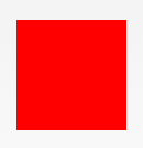
#square {
  width: 100px;
  height: 100px;
  background: red;
}
2.长方形
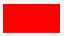
#rectangle {
  width: 200px;
  height: 100px;
  background: red;
}
3.圆形
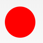
#circle {
  width: 100px;
  height: 100px;
  background: red;
  border-radius: 50%
}
4.椭圆形
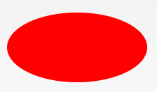
#oval {
  width: 200px;
  height: 100px;
  background: red;
  border-radius: 100px / 50px;
}
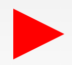
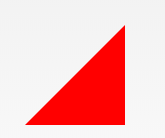
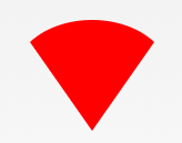
5.上三角
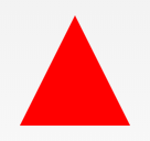
#triangle-up {
  width: 0;
  height: 0;
  border-left: 50px solid transparent;
  border-right: 50px solid transparent;
  border-bottom: 100px solid red;
}
6.下三角
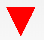
#triangle-down {
  width: 0;
  height: 0;
  border-left: 50px solid transparent;
  border-right: 50px solid transparent;
  border-top: 100px solid red;
}
7.左三角
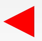
#triangle-left {
  width: 0;
  height: 0;
  border-top: 50px solid transparent;
  border-right: 100px solid red;
  border-bottom: 50px solid transparent;
}
8.右三角
#triangle-right {
  width: 0;
  height: 0;
  border-top: 50px solid transparent;
  border-left: 100px solid red;
  border-bottom: 50px solid transparent;
}
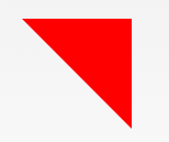
9.左上角
#triangle-topleft {
  width: 0;
  height: 0;
  border-top: 100px solid red;
  border-right: 100px solid transparent;
}
10.右上角
#triangle-topright {
  width: 0;
  height: 0;
  border-top: 100px solid red;
  border-left: 100px solid transparent;
}
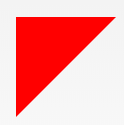
11.左下角
#triangle-bottomleft {
  width: 0;
  height: 0;
  border-bottom: 100px solid red;
  border-right: 100px solid transparent;
}
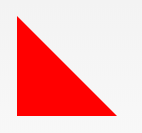
12.右下角
#triangle-bottomright {
  width: 0;
  height: 0;
  border-bottom: 100px solid red;
  border-left: 100px solid transparent;
}
13.箭头

#curvedarrow {
  position: relative;
  width: 0;
  height: 0;
  border-top: 9px solid transparent;
  border-right: 9px solid red;
  transform: rotate(10deg);
}
#curvedarrow:after {
  content: "";
  position: absolute;
  border: 0 solid transparent;
  border-top: 3px solid red;
  border-radius: 20px 0 0 0;
  top: -12px;
  left: -9px;
  width: 12px;
  height: 12px;
  transform: rotate(45deg);
}
14.梯形
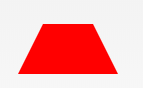
#trapezoid {
  border-bottom: 100px solid red;
  border-left: 25px solid transparent;
  border-right: 25px solid transparent;
  height: 0;
  width: 100px;
}
15.平行四边形
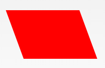
#parallelogram {
  width: 150px;
  height: 100px;
  transform: skew(20deg);
  background: red;
}
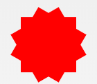
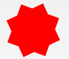
16.星星 (6角)
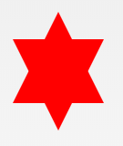
#star-six {
  width: 0;
  height: 0;
  border-left: 50px solid transparent;
  border-right: 50px solid transparent;
  border-bottom: 100px solid red;
  position: relative;
}
#star-six:after {
  width: 0;
  height: 0;
  border-left: 50px solid transparent;
  border-right: 50px solid transparent;
  border-top: 100px solid red;
  position: absolute;
  content: "";
  top: 30px;
  left: -50px;
}
17.星星 (5角)
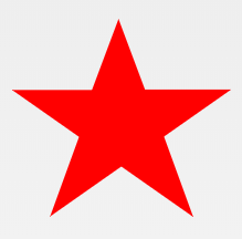
#star-five {
  margin: 50px 0;
  position: relative;
  display: block;
  color: red;
  width: 0px;
  height: 0px;
  border-right: 100px solid transparent;
  border-bottom: 70px solid red;
  border-left: 100px solid transparent;
  transform: rotate(35deg);
}
#star-five:before {
  border-bottom: 80px solid red;
  border-left: 30px solid transparent;
  border-right: 30px solid transparent;
  position: absolute;
  height: 0;
  width: 0;
  top: -45px;
  left: -65px;
  display: block;
  content: '';
  transform: rotate(-35deg);
}
#star-five:after {
  position: absolute;
  display: block;
  color: red;
  top: 3px;
  left: -105px;
  width: 0px;
  height: 0px;
  border-right: 100px solid transparent;
  border-bottom: 70px solid red;
  border-left: 100px solid transparent;
  transform: rotate(-70deg);
  content: '';
}
18.五边形
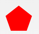
#pentagon {
  position: relative;
  width: 54px;
  box-sizing: content-box;
  border-width: 50px 18px 0;
  border-style: solid;
  border-color: red transparent;
}
#pentagon:before {
  content: "";
  position: absolute;
  height: 0;
  width: 0;
  top: -85px;
  left: -18px;
  border-width: 0 45px 35px;
  border-style: solid;
  border-color: transparent transparent red;
}
19.六边形
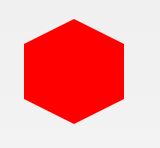
#hexagon {
  width: 100px;
  height: 55px;
  background: red;
  position: relative;
}
#hexagon:before {
  content: "";
  position: absolute;
  top: -25px;
  left: 0;
  width: 0;
  height: 0;
  border-left: 50px solid transparent;
  border-right: 50px solid transparent;
  border-bottom: 25px solid red;
}
#hexagon:after {
  content: "";
  position: absolute;
  bottom: -25px;
  left: 0;
  width: 0;
  height: 0;
  border-left: 50px solid transparent;
  border-right: 50px solid transparent;
  border-top: 25px solid red;
}
20.八边形
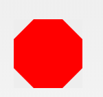
#octagon {
  width: 100px;
  height: 100px;
  background: red;
  position: relative;
}
#octagon:before {
  content: "";
  width: 100px;
  height: 0;
  position: absolute;
  top: 0;
  left: 0;
  border-bottom: 29px solid red;
  border-left: 29px solid #eee;
  border-right: 29px solid #eee;
}
#octagon:after {
  content: "";
  width: 100px;
  height: 0;
  position: absolute;
  bottom: 0;
  left: 0;
  border-top: 29px solid red;
  border-left: 29px solid #eee;
  border-right: 29px solid #eee;
}
21.爱心
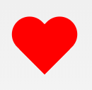
#heart {
  position: relative;
  width: 100px;
  height: 90px;
}
#heart:before,
#heart:after {
  position: absolute;
  content: "";
  left: 50px;
  top: 0;
  width: 50px;
  height: 80px;
  background: red;
  border-radius: 50px 50px 0 0;
  transform: rotate(-45deg);
  transform-origin: 0 100%;
}
#heart:after {
  left: 0;
  transform: rotate(45deg);
  transform-origin: 100% 100%;
}
22.无穷大
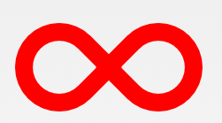
#infinity {
  position: relative;
  width: 212px;
  height: 100px;
  box-sizing: content-box;
}
#infinity:before,
#infinity:after {
  content: "";
  box-sizing: content-box;
  position: absolute;
  top: 0;
  left: 0;
  width: 60px;
  height: 60px;
  border: 20px solid red;
  border-radius: 50px 50px 0 50px;
  transform: rotate(-45deg);
}
#infinity:after {
  left: auto;
  right: 0;
  border-radius: 50px 50px 50px 0;
  transform: rotate(45deg);
}
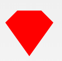
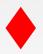
23.菱形
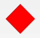
#diamond {
  width: 0;
  height: 0;
  border: 50px solid transparent;
  border-bottom-color: red;
  position: relative;
  top: -50px;
}
#diamond:after {
  content: '';
  position: absolute;
  left: -50px;
  top: 50px;
  width: 0;
  height: 0;
  border: 50px solid transparent;
  border-top-color: red;
}
代码部署后可能存在的BUG没法实时知道,事后为了解决这些BUG,花了大量的时间进行log 调试,这边顺便给大家推荐一个好用的BUG监控工具 Fundebug。
24.钻石1
#diamond-shield {
  width: 0;
  height: 0;
  border: 50px solid transparent;
  border-bottom: 20px solid red;
  position: relative;
  top: -50px;
}
#diamond-shield:after {
  content: '';
  position: absolute;
  left: -50px;
  top: 20px;
  width: 0;
  height: 0;
  border: 50px solid transparent;
  border-top: 70px solid red;
}
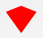
25.钻石2
#cut-diamond {
  border-style: solid;
  border-color: transparent transparent red transparent;
  border-width: 0 25px 25px 25px;
  height: 0;
  width: 50px;
  box-sizing: content-box;
  position: relative;
  margin: 20px 0 50px 0;
}
#cut-diamond:after {
  content: "";
  position: absolute;
  top: 25px;
  left: -25px;
  width: 0;
  height: 0;
  border-style: solid;
  border-color: red transparent transparent transparent;
  border-width: 70px 50px 0 50px;
}
26.钻戒
#diamond-narrow {
  width: 0;
  height: 0;
  border: 50px solid transparent;
  border-bottom: 70px solid red;
  position: relative;
  top: -50px;
}
#diamond-narrow:after {
  content: '';
  position: absolute;
  left: -50px;
  top: 70px;
  width: 0;
  height: 0;
  border: 50px solid transparent;
  border-top: 70px solid red;
}
27. 鸡蛋
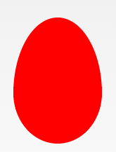
#egg {
  display: block;
  width: 126px;
  height: 180px;
  background-color: red;
  border-radius: 50% 50% 50% 50% / 60% 60% 40% 40%;
}
28.吃豆人

#pacman {
  width: 0px;
  height: 0px;
  border-right: 60px solid transparent;
  border-top: 60px solid red;
  border-left: 60px solid red;
  border-bottom: 60px solid red;
  border-top-left-radius: 60px;
  border-top-right-radius: 60px;
  border-bottom-left-radius: 60px;
  border-bottom-right-radius: 60px;
}
29.对话泡泡
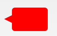
#talkbubble {
  width: 120px;
  height: 80px;
  background: red;
  position: relative;
  -moz-border-radius: 10px;
  -webkit-border-radius: 10px;
  border-radius: 10px;
}
#talkbubble:before {
  content: "";
  position: absolute;
  right: 100%;
  top: 26px;
  width: 0;
  height: 0;
  border-top: 13px solid transparent;
  border-right: 26px solid red;
  border-bottom: 13px solid transparent;
}
30. 12点 爆发
#burst-12 {
  background: red;
  width: 80px;
  height: 80px;
  position: relative;
  text-align: center;
}
#burst-12:before,
#burst-12:after {
  content: "";
  position: absolute;
  top: 0;
  left: 0;
  height: 80px;
  width: 80px;
  background: red;
}
#burst-12:before {
  transform: rotate(30deg);
}
#burst-12:after {
  transform: rotate(60deg);
}
31. 8点 爆发
#burst-8 {
  background: red;
  width: 80px;
  height: 80px;
  position: relative;
  text-align: center;
  transform: rotate(20deg);
}
#burst-8:before {
  content: "";
  position: absolute;
  top: 0;
  left: 0;
  height: 80px;
  width: 80px;
  background: red;
  transform: rotate(135deg);
}
32.太极
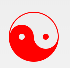
#yin-yang {
  width: 96px;
  box-sizing: content-box;
  height: 48px;
  background: #eee;
  border-color: red;
  border-style: solid;
  border-width: 2px 2px 50px 2px;
  border-radius: 100%;
  position: relative;
}
#yin-yang:before {
  content: "";
  position: absolute;
  top: 50%;
  left: 0;
  background: #eee;
  border: 18px solid red;
  border-radius: 100%;
  width: 12px;
  height: 12px;
  box-sizing: content-box;
}
#yin-yang:after {
  content: "";
  position: absolute;
  top: 50%;
  left: 50%;
  background: red;
  border: 18px solid #eee;
  border-radius: 100%;
  width: 12px;
  height: 12px;
  box-sizing: content-box;
}
33.徽章丝带

#badge-ribbon {
  position: relative;
  background: red;
  height: 100px;
  width: 100px;
  border-radius: 50px;
}
#badge-ribbon:before,
#badge-ribbon:after {
  content: '';
  position: absolute;
  border-bottom: 70px solid red;
  border-left: 40px solid transparent;
  border-right: 40px solid transparent;
  top: 70px;
  left: -10px;
  transform: rotate(-140deg);
}
#badge-ribbon:after {
  left: auto;
  right: -10px;
  transform: rotate(140deg);
}
34.太空入侵者(电脑游戏名)

#space-invader {
  box-shadow: 0 0 0 1em red,
  0 1em 0 1em red,
  -2.5em 1.5em 0 .5em red,
  2.5em 1.5em 0 .5em red,
  -3em -3em 0 0 red,
  3em -3em 0 0 red,
  -2em -2em 0 0 red,
  2em -2em 0 0 red,
  -3em -1em 0 0 red,
  -2em -1em 0 0 red,
  2em -1em 0 0 red,
  3em -1em 0 0 red,
  -4em 0 0 0 red,
  -3em 0 0 0 red,
  3em 0 0 0 red,
  4em 0 0 0 red,
  -5em 1em 0 0 red,
  -4em 1em 0 0 red,
  4em 1em 0 0 red,
  5em 1em 0 0 red,
  -5em 2em 0 0 red,
  5em 2em 0 0 red,
  -5em 3em 0 0 red,
  -3em 3em 0 0 red,
  3em 3em 0 0 red,
  5em 3em 0 0 red,
  -2em 4em 0 0 red,
  -1em 4em 0 0 red,
  1em 4em 0 0 red,
  2em 4em 0 0 red;
  background: red;
  width: 1em;
  height: 1em;
  overflow: hidden;
  margin: 50px 0 70px 65px;
}
35.电视
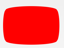
#tv {
  position: relative;
  width: 200px;
  height: 150px;
  margin: 20px 0;
  background: red;
  border-radius: 50% / 10%;
  color: white;
  text-align: center;
  text-indent: .1em;
}
#tv:before {
  content: '';
  position: absolute;
  top: 10%;
  bottom: 10%;
  right: -5%;
  left: -5%;
  background: inherit;
  border-radius: 5% / 50%;
}
36.雪佛龙
#chevron {
  position: relative;
  text-align: center;
  padding: 12px;
  margin-bottom: 6px;
  height: 60px;
  width: 200px;
}
#chevron:before {
  content: '';
  position: absolute;
  top: 0;
  left: 0;
  height: 100%;
  width: 51%;
  background: red;
  transform: skew(0deg, 6deg);
}
#chevron:after {
  content: '';
  position: absolute;
  top: 0;
  right: 0;
  height: 100%;
  width: 50%;
  background: red;
  transform: skew(0deg, -6deg);
}
37.放大镜
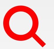
#magnifying-glass {
  font-size: 10em;
  display: inline-block;
  width: 0.4em;
  box-sizing: content-box;
  height: 0.4em;
  border: 0.1em solid red;
  position: relative;
  border-radius: 0.35em;
}
#magnifying-glass:before {
  content: "";
  display: inline-block;
  position: absolute;
  right: -0.25em;
  bottom: -0.1em;
  border-width: 0;
  background: red;
  width: 0.35em;
  height: 0.08em;
  transform: rotate(45deg);
}
38.Facebook图标

#facebook-icon {
  background: red;
  text-indent: -999em;
  width: 100px;
  height: 110px;
  box-sizing: content-box;
  border-radius: 5px;
  position: relative;
  overflow: hidden;
  border: 15px solid red;
  border-bottom: 0;
}
#facebook-icon:before {
  content: "/20";
  position: absolute;
  background: red;
  width: 40px;
  height: 90px;
  bottom: -30px;
  right: -37px;
  border: 20px solid #eee;
  border-radius: 25px;
  box-sizing: content-box;
}
#facebook-icon:after {
  content: "/20";
  position: absolute;
  width: 55px;
  top: 50px;
  height: 20px;
  background: #eee;
  right: 5px;
  box-sizing: content-box;
}
39.月亮
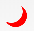
#moon {
  width: 80px;
  height: 80px;
  border-radius: 50%;
  box-shadow: 15px 15px 0 0 red;
}
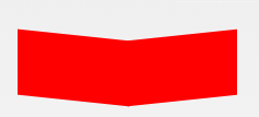
40.旗
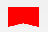
#flag {
  width: 110px;
  height: 56px;
  box-sizing: content-box;
  padding-top: 15px;
  position: relative;
  background: red;
  color: white;
  font-size: 11px;
  letter-spacing: 0.2em;
  text-align: center;
  text-transform: uppercase;
}
#flag:after {
  content: "";
  position: absolute;
  left: 0;
  bottom: 0;
  width: 0;
  height: 0;
  border-bottom: 13px solid #eee;
  border-left: 55px solid transparent;
  border-right: 55px solid transparent;
}
41.圆锥
 #cone {
  width: 0;
  height: 0;
  border-left: 70px solid transparent;
  border-right: 70px solid transparent;
  border-top: 100px solid red;
  border-radius: 50%;
}
42.十字架
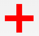
#cross {
  background: red;
  height: 100px;
  position: relative;
  width: 20px;
}
#cross:after {
  background: red;
  content: "";
  height: 20px;
  left: -40px;
  position: absolute;
  top: 40px;
  width: 100px;
}
43.根基
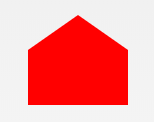
 #base {
  background: red;
  display: inline-block;
  height: 55px;
  margin-left: 20px;
  margin-top: 55px;
  position: relative;
  width: 100px;
}
#base:before {
  border-bottom: 35px solid red;
  border-left: 50px solid transparent;
  border-right: 50px solid transparent;
  content: "";
  height: 0;
  left: 0;
  position: absolute;
  top: -35px;
  width: 0;
}
44.指示器
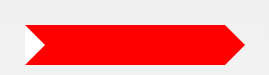
#pointer {
  width: 200px;
  height: 40px;
  position: relative;
  background: red;
}
#pointer:after {
  content: "";
  position: absolute;
  left: 0;
  bottom: 0;
  width: 0;
  height: 0;
  border-left: 20px solid white;
  border-top: 20px solid transparent;
  border-bottom: 20px solid transparent;
}
#pointer:before {
  content: "";
  position: absolute;
  right: -20px;
  bottom: 0;
  width: 0;
  height: 0;
  border-left: 20px solid red;
  border-top: 20px solid transparent;
  border-bottom: 20px solid transparent;
}
45.锁

#lock {
  font-size: 8px;
  position: relative;
  width: 18em;
  height: 13em;
  border-radius: 2em;
  top: 10em;
  box-sizing: border-box;
  border: 3.5em solid red;
  border-right-width: 7.5em;
  border-left-width: 7.5em;
  margin: 0 0 6rem 0;
}
#lock:before {
  content: "";
  box-sizing: border-box;
  position: absolute;
  border: 2.5em solid red;
  width: 14em;
  height: 12em;
  left: 50%;
  margin-left: -7em;
  top: -12em;
  border-top-left-radius: 7em;
  border-top-right-radius: 7em;
}
#lock:after {
  content: "";
  box-sizing: border-box;
  position: absolute;
  border: 1em solid red;
  width: 5em;
  height: 8em;
  border-radius: 2.5em;
  left: 50%;
  top: -1em;
  margin-left: -2.5em;
}