一、概述
SVG 是一种基于 XML 语法的图像格式,全称是可缩放矢量图(Scalable Vector Graphics)。其他图像格式都是基于像素处理的,SVG 则是属于对图像的形状描述,所以它本质上是文本文件,体积较小,且不管放大多少倍都不会失真。
1533731400-5552-ctS55l0tjplHBGG4qmOVTBf19PQw
SVG 文件可以直接插入网页,成为 DOM 的一部分,然后用 JavaScript 和 CSS 进行操作。
一、概述
SVG 是一种基于 XML 语法的图像格式,全称是可缩放矢量图(Scalable Vector Graphics)。其他图像格式都是基于像素处理的,SVG 则是属于对图像的形状描述,所以它本质上是文本文件,体积较小,且不管放大多少倍都不会失真。
1533731400-5552-ctS55l0tjplHBGG4qmOVTBf19PQw
SVG 文件可以直接插入网页,成为 DOM 的一部分,然后用 JavaScript 和 CSS 进行操作。
我也是因为业务需要,需要给头像做一个进度条,查看效果图:

实现的代码也是网上搜索的,这里我讲解一下实现的原理:
使用svg画一个圆,然后分成5段,每段的颜色值可以渐变,当然也可以纯色,我是使用了纯色的。
下面来看一下CSS代码:
<style>
    body {
        background-color: #fff
    }

    @-webkit-keyframes load {
        0% {
            stroke-dashoffset: 0;
        }
    }

    @keyframes load {
        0% {
            stroke-dashoffset: 0;
        }
    }

    .progress {
        position: relative;
        display: inline-block;
        padding: 0;
        text-align: center;
    }

    .progress > li {
        display: inline-block;
        position: relative;
        text-align: center;
        color: #93A2AC;
        font-family: Lato;
        font-weight: 100;
        margin: 2rem;
    }

    .progress > li:before {
        content: attr(data-name);
        position: absolute;
        width: 100%;
        bottom: -2rem;
        font-weight: 400;
    }

    .progress > li:after {
        content: attr(data-percent);
        position: absolute;
        width: 100%;
        top: 3.7rem;
        left: 0;
        font-size: 2rem;
        text-align: center;
    }

    .progress svg {
        width: 10rem;
        height: 10rem;
    }

    .progress svg:nth-child(2) {
        position: absolute;
        left: 0;
        top: 0;
        -webkit-transform: rotate(-90deg);
        transform: rotate(-90deg);
    }

    .progress svg:nth-child(2) path {
        fill: none;
        stroke-width: 25;
        stroke-dasharray: 629;
        stroke: #fff;
        opacity: .9;
        -webkit-animation: load 10s;
        animation: load 10s;
    }
</style>
可以之间是10秒,如果喜欢短一点的,可以改一下样式“progress svg:nth-child(2) path”中的10s;
现在来看看html代码:
<ul class="progress">
    <!--  Item  -->
    <li data-name="HTML5 Skill" data-percent="87%">
        <svg viewBox="-10 -10 220 220">
            <g fill="none" stroke-width="2" transform="translate(100,100)">
                <path d="M 0,-100 A 100,100 0 0,1 86.6,-50" stroke="url(#cl1)"></path>
                <path d="M 86.6,-50 A 100,100 0 0,1 86.6,50" stroke="url(#cl2)"></path>
                <path d="M 86.6,50 A 100,100 0 0,1 0,100" stroke="url(#cl3)"></path>
                <path d="M 0,100 A 100,100 0 0,1 -86.6,50" stroke="url(#cl4)"></path>
                <path d="M -86.6,50 A 100,100 0 0,1 -86.6,-50" stroke="url(#cl5)"></path>
                <path d="M -86.6,-50 A 100,100 0 0,1 0,-100" stroke="url(#cl6)"></path>
            </g>
        </svg>
        <svg viewBox="-10 -10 220 220">
            <path d="M200,100 C200,44.771525 155.228475,0 100,0 C44.771525,0 0,44.771525 0,100 C0,155.228475 44.771525,200 100,200 C155.228475,200 200,155.228475 200,100 Z"
                  stroke-dashoffset="547"></path>
        </svg>
    </li>
    <!--  Item  -->
    <li data-name="jQuery Skill" data-percent="65%">
        <svg viewBox="-10 -10 220 220">
            <g fill="none" stroke-width="12" transform="translate(100,100)">
                <path d="M 0,-100 A 100,100 0 0,1 86.6,-50" stroke="url(#cl1)"></path>
                <path d="M 86.6,-50 A 100,100 0 0,1 86.6,50" stroke="url(#cl2)"></path>
                <path d="M 86.6,50 A 100,100 0 0,1 0,100" stroke="url(#cl3)"></path>
                <path d="M 0,100 A 100,100 0 0,1 -86.6,50" stroke="url(#cl4)"></path>
                <path d="M -86.6,50 A 100,100 0 0,1 -86.6,-50" stroke="url(#cl5)"></path>
                <path d="M -86.6,-50 A 100,100 0 0,1 0,-100" stroke="url(#cl6)"></path>
            </g>
        </svg>
        <svg viewBox="-10 -10 220 220">
            <path d="M200,100 C200,44.771525 155.228475,0 100,0 C44.771525,0 0,44.771525 0,100 C0,155.228475 44.771525,200 100,200 C155.228475,200 200,155.228475 200,100 Z"
                  stroke-dashoffset="200"></path>
        </svg>
    </li>
</ul>
其中data-name属性是标题名称,data-percent是中间的进度描述,我自己项目整理的时候把这段的CSS代码过滤了,因为我不需要显示这些,进度的控制是在svg中path元素的stroke-dashoffset属性中:
100%=629,也就是1%=6.29,自己根据进度乘一下。另外需要说一下的就是g元素中的stroke-width属性是控制宽度的。
颜色是在另外一个avg中控制的,可以看到path路径有一个stroke=”url(#cl6)”属性,这个就是控制段的颜色,下面附上代码:
<svg width="0" height="0">
    <defs>
        <lineargradient id="cl1" gradientUnits="objectBoundingBox" x1="0" y1="0" x2="1" y2="1">
            <stop stop-color="#08DA24"></stop>
            <stop offset="100%" stop-color="#08DA24"></stop>
        </lineargradient>
        <lineargradient id="cl2" gradientUnits="objectBoundingBox" x1="0" y1="0" x2="0" y2="1">
            <stop stop-color="#08DA24"></stop>
            <stop offset="100%" stop-color="#08DA24"></stop>
        </lineargradient>
        <lineargradient id="cl3" gradientUnits="objectBoundingBox" x1="1" y1="0" x2="0" y2="1">
            <stop stop-color="#08DA24"></stop>
            <stop offset="100%" stop-color="#08DA24"></stop>
        </lineargradient>
        <lineargradient id="cl4" gradientUnits="objectBoundingBox" x1="1" y1="1" x2="0" y2="0">
            <stop stop-color="#08DA24"></stop>
            <stop offset="100%" stop-color="#08DA24"></stop>
        </lineargradient>
        <lineargradient id="cl5" gradientUnits="objectBoundingBox" x1="0" y1="1" x2="0" y2="0">
            <stop stop-color="#08DA24"></stop>
            <stop offset="100%" stop-color="#08DA24"></stop>
        </lineargradient>
        <lineargradient id="cl6" gradientUnits="objectBoundingBox" x1="0" y1="1" x2="1" y2="0">
            <stop stop-color="#08DA24"></stop>
            <stop offset="100%" stop-color="#08DA24"></stop>
        </lineargradient>
    </defs>
</svg>
下面来看看效果图:
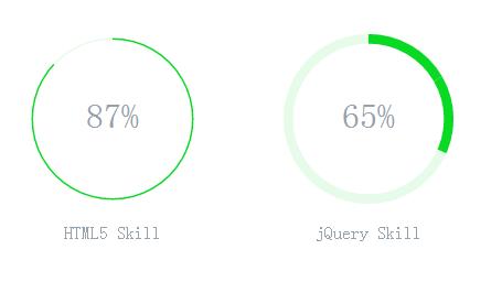
下面奉上全部源代码:
<ul class="progress">
    <!--  Item  -->
    <li data-name="HTML5 Skill" data-percent="87%">
        <svg viewBox="-10 -10 220 220">
            <g fill="none" stroke-width="2" transform="translate(100,100)">
                <path d="M 0,-100 A 100,100 0 0,1 86.6,-50" stroke="url(#cl1)"></path>
                <path d="M 86.6,-50 A 100,100 0 0,1 86.6,50" stroke="url(#cl2)"></path>
                <path d="M 86.6,50 A 100,100 0 0,1 0,100" stroke="url(#cl3)"></path>
                <path d="M 0,100 A 100,100 0 0,1 -86.6,50" stroke="url(#cl4)"></path>
                <path d="M -86.6,50 A 100,100 0 0,1 -86.6,-50" stroke="url(#cl5)"></path>
                <path d="M -86.6,-50 A 100,100 0 0,1 0,-100" stroke="url(#cl6)"></path>
            </g>
        </svg>
        <svg viewBox="-10 -10 220 220">
            <path d="M200,100 C200,44.771525 155.228475,0 100,0 C44.771525,0 0,44.771525 0,100 C0,155.228475 44.771525,200 100,200 C155.228475,200 200,155.228475 200,100 Z"
                  stroke-dashoffset="547"></path>
        </svg>
    </li>
    <!--  Item  -->
    <li data-name="jQuery Skill" data-percent="65%">
        <svg viewBox="-10 -10 220 220">
            <g fill="none" stroke-width="12" transform="translate(100,100)">
                <path d="M 0,-100 A 100,100 0 0,1 86.6,-50" stroke="url(#cl1)"></path>
                <path d="M 86.6,-50 A 100,100 0 0,1 86.6,50" stroke="url(#cl2)"></path>
                <path d="M 86.6,50 A 100,100 0 0,1 0,100" stroke="url(#cl3)"></path>
                <path d="M 0,100 A 100,100 0 0,1 -86.6,50" stroke="url(#cl4)"></path>
                <path d="M -86.6,50 A 100,100 0 0,1 -86.6,-50" stroke="url(#cl5)"></path>
                <path d="M -86.6,-50 A 100,100 0 0,1 0,-100" stroke="url(#cl6)"></path>
            </g>
        </svg>
        <svg viewBox="-10 -10 220 220">
            <path d="M200,100 C200,44.771525 155.228475,0 100,0 C44.771525,0 0,44.771525 0,100 C0,155.228475 44.771525,200 100,200 C155.228475,200 200,155.228475 200,100 Z"
                  stroke-dashoffset="200"></path>
        </svg>
    </li>
</ul>

<!--  Defining Angle Gradient Colors  -->
<svg width="0" height="0">
    <defs>
        <lineargradient id="cl1" gradientUnits="objectBoundingBox" x1="0" y1="0" x2="1" y2="1">
            <stop stop-color="#08DA24"></stop>
            <stop offset="100%" stop-color="#08DA24"></stop>
        </lineargradient>
        <lineargradient id="cl2" gradientUnits="objectBoundingBox" x1="0" y1="0" x2="0" y2="1">
            <stop stop-color="#08DA24"></stop>
            <stop offset="100%" stop-color="#08DA24"></stop>
        </lineargradient>
        <lineargradient id="cl3" gradientUnits="objectBoundingBox" x1="1" y1="0" x2="0" y2="1">
            <stop stop-color="#08DA24"></stop>
            <stop offset="100%" stop-color="#08DA24"></stop>
        </lineargradient>
        <lineargradient id="cl4" gradientUnits="objectBoundingBox" x1="1" y1="1" x2="0" y2="0">
            <stop stop-color="#08DA24"></stop>
            <stop offset="100%" stop-color="#08DA24"></stop>
        </lineargradient>
        <lineargradient id="cl5" gradientUnits="objectBoundingBox" x1="0" y1="1" x2="0" y2="0">
            <stop stop-color="#08DA24"></stop>
            <stop offset="100%" stop-color="#08DA24"></stop>
        </lineargradient>
        <lineargradient id="cl6" gradientUnits="objectBoundingBox" x1="0" y1="1" x2="1" y2="0">
            <stop stop-color="#08DA24"></stop>
            <stop offset="100%" stop-color="#08DA24"></stop>
        </lineargradient>
    </defs>
</svg>

<style>
    body {
        background-color: #fff
    }

    @-webkit-keyframes load {
        0% {
            stroke-dashoffset: 0;
        }
    }

    @keyframes load {
        0% {
            stroke-dashoffset: 0;
        }
    }

    .progress {
        position: relative;
        display: inline-block;
        padding: 0;
        text-align: center;
    }

    .progress > li {
        display: inline-block;
        position: relative;
        text-align: center;
        color: #93A2AC;
        font-family: Lato;
        font-weight: 100;
        margin: 2rem;
    }

    .progress > li:before {
        content: attr(data-name);
        position: absolute;
        width: 100%;
        bottom: -2rem;
        font-weight: 400;
    }

    .progress > li:after {
        content: attr(data-percent);
        position: absolute;
        width: 100%;
        top: 3.7rem;
        left: 0;
        font-size: 2rem;
        text-align: center;
    }

    .progress svg {
        width: 10rem;
        height: 10rem;
    }

    .progress svg:nth-child(2) {
        position: absolute;
        left: 0;
        top: 0;
        -webkit-transform: rotate(-90deg);
        transform: rotate(-90deg);
    }

    .progress svg:nth-child(2) path {
        fill: none;
        stroke-width: 25;
        stroke-dasharray: 629;
        stroke: #fff;
        opacity: .9;
        -webkit-animation: load 10s;
        animation: load 10s;
    }
</style>
拷贝一下,就可以运行了。
一.数据分区
mysql数据库中的数据是以文件的形式存储在磁盘介质上,具体存储目录,请查阅“my.cnf”中的“datadir”属性。一张数据表主要对应着三个文件,一个是FRM存放表结构的,一个是MYD存放表数据的,一个是MYI存表索引的。如果一张表的数据量太大的话,那么MYD、MYI就会变的很大,查找数据就会变得很慢,这个时候可以利用mysql的分区功能,在物理上将这一张表对应的三个文件,分割成许多个小块,这样做的话,我们查找一条数据时,就不用全部查找了,只要知道这条数据在哪一块,然后在那一块找就行了。如果表的数据太大,可能一个磁盘放不下,这个时候,我们可以把数据分配到不同的磁盘里面去。
1.横向分区
就是横着来分区,举例:假如有100W条数据,分成十份,前10W条数据放到第一个分区,第二个10W条数据放到第二个分区,依此类推。也就是把表分成了十分,根用merge来分表,有点像哦。取出一条数据的时候,这条数据包含了表结构中的所有字段,也就是说横向分区,并没有改变表的结构。
2.纵向分区
什么是纵向分区呢?就是竖来分区了,举例来说明,在设计用户表的时候,开始的时候没有考虑好,而把个人的所有信息都放到了一张表里面去,这样这个表里面就会有比较大的字段,如个人简介,而这些简介呢,也许不会有好多人去看,所以等到有人要看的时候,在去查找,分表的时候,可以把这样的大字段,分开来。
mysql提供的分区属于第一种,横向分区,并且细分成很多种方式
在读《高性能MySql》一书中,认识了NewRelic,但是还未能及时用上,所以在网上找了一个帖子以记录。
NewRelic是一家提供Rails性能监测服务的网站, NewRelic提供了不同级别的监测功能,免费的是Lite版本,最高有Gold版本.
New Relic工具有两种运行模式:
(1)Production 模式:当您的工程以生产模式运行时,您可以在rpm.newrelic.com 网站上实时对它进行监督。
(2)Developer模式:当您的工程以开发模式运行时,您可以在本地localhost:3000/newrelic网页上查看到性能分析数据。
New Relic工具安装步骤(默认Rails 3版本):
3.在当前工程下,bundle update
6.若在production模式下启动工程,则您访问http://localhost:3000/newrelic链接会失效,这时您可以通过https://rpm.newrelic.com/login进行登录,在NewRelic的网站上查看关于工程的性能分析数据。
1、什么是基准测试
数据库的基准测试是对数据库的性能指标进行定量的、可复现的、可对比的测试。
基准测试与压力测试
基准测试可以理解为针对系统的一种压力测试。但基准测试不关心业务逻辑,更加简单、直接、易于测试,数据可以由工具生成,不要求真实;而压力测试一般考虑业务逻辑(如购物车业务),要求真实的数据。
2、基准测试的作用
对于多数Web应用,整个系统的瓶颈在于数据库;原因很简单:Web应用中的其他因素,例如网络带宽、负载均衡节点、应用服务器(包括CPU、内存、硬盘灯、连接数等)、缓存,都很容易通过水平的扩展(俗称加机器)来实现性能的提高。而对于MySQL,由于数据一致性的要求,无法通过增加机器来分散向数据库写数据带来的压力;虽然可以通过前置缓存(Redis等)、读写分离、分库分表来减轻压力,但是与系统其它组件的水平扩展相比,受到了太多的限制。
而对数据库的基准测试的作用,就是分析在当前的配置下(包括硬件配置、OS、数据库设置等),数据库的性能表现,从而找出MySQL的性能阈值,并根据实际系统的要求调整配置。

近期评论