我也是因为业务需要,需要给头像做一个进度条,查看效果图:

实现的代码也是网上搜索的,这里我讲解一下实现的原理:
使用svg画一个圆,然后分成5段,每段的颜色值可以渐变,当然也可以纯色,我是使用了纯色的。
下面来看一下CSS代码:
<style>
    body {
        background-color: #fff
    }

    @-webkit-keyframes load {
        0% {
            stroke-dashoffset: 0;
        }
    }

    @keyframes load {
        0% {
            stroke-dashoffset: 0;
        }
    }

    .progress {
        position: relative;
        display: inline-block;
        padding: 0;
        text-align: center;
    }

    .progress > li {
        display: inline-block;
        position: relative;
        text-align: center;
        color: #93A2AC;
        font-family: Lato;
        font-weight: 100;
        margin: 2rem;
    }

    .progress > li:before {
        content: attr(data-name);
        position: absolute;
        width: 100%;
        bottom: -2rem;
        font-weight: 400;
    }

    .progress > li:after {
        content: attr(data-percent);
        position: absolute;
        width: 100%;
        top: 3.7rem;
        left: 0;
        font-size: 2rem;
        text-align: center;
    }

    .progress svg {
        width: 10rem;
        height: 10rem;
    }

    .progress svg:nth-child(2) {
        position: absolute;
        left: 0;
        top: 0;
        -webkit-transform: rotate(-90deg);
        transform: rotate(-90deg);
    }

    .progress svg:nth-child(2) path {
        fill: none;
        stroke-width: 25;
        stroke-dasharray: 629;
        stroke: #fff;
        opacity: .9;
        -webkit-animation: load 10s;
        animation: load 10s;
    }
</style>
可以之间是10秒,如果喜欢短一点的,可以改一下样式“progress svg:nth-child(2) path”中的10s;
现在来看看html代码:
<ul class="progress">
    <!--  Item  -->
    <li data-name="HTML5 Skill" data-percent="87%">
        <svg viewBox="-10 -10 220 220">
            <g fill="none" stroke-width="2" transform="translate(100,100)">
                <path d="M 0,-100 A 100,100 0 0,1 86.6,-50" stroke="url(#cl1)"></path>
                <path d="M 86.6,-50 A 100,100 0 0,1 86.6,50" stroke="url(#cl2)"></path>
                <path d="M 86.6,50 A 100,100 0 0,1 0,100" stroke="url(#cl3)"></path>
                <path d="M 0,100 A 100,100 0 0,1 -86.6,50" stroke="url(#cl4)"></path>
                <path d="M -86.6,50 A 100,100 0 0,1 -86.6,-50" stroke="url(#cl5)"></path>
                <path d="M -86.6,-50 A 100,100 0 0,1 0,-100" stroke="url(#cl6)"></path>
            </g>
        </svg>
        <svg viewBox="-10 -10 220 220">
            <path d="M200,100 C200,44.771525 155.228475,0 100,0 C44.771525,0 0,44.771525 0,100 C0,155.228475 44.771525,200 100,200 C155.228475,200 200,155.228475 200,100 Z"
                  stroke-dashoffset="547"></path>
        </svg>
    </li>
    <!--  Item  -->
    <li data-name="jQuery Skill" data-percent="65%">
        <svg viewBox="-10 -10 220 220">
            <g fill="none" stroke-width="12" transform="translate(100,100)">
                <path d="M 0,-100 A 100,100 0 0,1 86.6,-50" stroke="url(#cl1)"></path>
                <path d="M 86.6,-50 A 100,100 0 0,1 86.6,50" stroke="url(#cl2)"></path>
                <path d="M 86.6,50 A 100,100 0 0,1 0,100" stroke="url(#cl3)"></path>
                <path d="M 0,100 A 100,100 0 0,1 -86.6,50" stroke="url(#cl4)"></path>
                <path d="M -86.6,50 A 100,100 0 0,1 -86.6,-50" stroke="url(#cl5)"></path>
                <path d="M -86.6,-50 A 100,100 0 0,1 0,-100" stroke="url(#cl6)"></path>
            </g>
        </svg>
        <svg viewBox="-10 -10 220 220">
            <path d="M200,100 C200,44.771525 155.228475,0 100,0 C44.771525,0 0,44.771525 0,100 C0,155.228475 44.771525,200 100,200 C155.228475,200 200,155.228475 200,100 Z"
                  stroke-dashoffset="200"></path>
        </svg>
    </li>
</ul>
其中data-name属性是标题名称,data-percent是中间的进度描述,我自己项目整理的时候把这段的CSS代码过滤了,因为我不需要显示这些,进度的控制是在svg中path元素的stroke-dashoffset属性中:
100%=629,也就是1%=6.29,自己根据进度乘一下。另外需要说一下的就是g元素中的stroke-width属性是控制宽度的。
颜色是在另外一个avg中控制的,可以看到path路径有一个stroke=”url(#cl6)”属性,这个就是控制段的颜色,下面附上代码:
<svg width="0" height="0">
    <defs>
        <lineargradient id="cl1" gradientUnits="objectBoundingBox" x1="0" y1="0" x2="1" y2="1">
            <stop stop-color="#08DA24"></stop>
            <stop offset="100%" stop-color="#08DA24"></stop>
        </lineargradient>
        <lineargradient id="cl2" gradientUnits="objectBoundingBox" x1="0" y1="0" x2="0" y2="1">
            <stop stop-color="#08DA24"></stop>
            <stop offset="100%" stop-color="#08DA24"></stop>
        </lineargradient>
        <lineargradient id="cl3" gradientUnits="objectBoundingBox" x1="1" y1="0" x2="0" y2="1">
            <stop stop-color="#08DA24"></stop>
            <stop offset="100%" stop-color="#08DA24"></stop>
        </lineargradient>
        <lineargradient id="cl4" gradientUnits="objectBoundingBox" x1="1" y1="1" x2="0" y2="0">
            <stop stop-color="#08DA24"></stop>
            <stop offset="100%" stop-color="#08DA24"></stop>
        </lineargradient>
        <lineargradient id="cl5" gradientUnits="objectBoundingBox" x1="0" y1="1" x2="0" y2="0">
            <stop stop-color="#08DA24"></stop>
            <stop offset="100%" stop-color="#08DA24"></stop>
        </lineargradient>
        <lineargradient id="cl6" gradientUnits="objectBoundingBox" x1="0" y1="1" x2="1" y2="0">
            <stop stop-color="#08DA24"></stop>
            <stop offset="100%" stop-color="#08DA24"></stop>
        </lineargradient>
    </defs>
</svg>
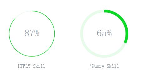
下面来看看效果图:
下面奉上全部源代码:
<ul class="progress">
    <!--  Item  -->
    <li data-name="HTML5 Skill" data-percent="87%">
        <svg viewBox="-10 -10 220 220">
            <g fill="none" stroke-width="2" transform="translate(100,100)">
                <path d="M 0,-100 A 100,100 0 0,1 86.6,-50" stroke="url(#cl1)"></path>
                <path d="M 86.6,-50 A 100,100 0 0,1 86.6,50" stroke="url(#cl2)"></path>
                <path d="M 86.6,50 A 100,100 0 0,1 0,100" stroke="url(#cl3)"></path>
                <path d="M 0,100 A 100,100 0 0,1 -86.6,50" stroke="url(#cl4)"></path>
                <path d="M -86.6,50 A 100,100 0 0,1 -86.6,-50" stroke="url(#cl5)"></path>
                <path d="M -86.6,-50 A 100,100 0 0,1 0,-100" stroke="url(#cl6)"></path>
            </g>
        </svg>
        <svg viewBox="-10 -10 220 220">
            <path d="M200,100 C200,44.771525 155.228475,0 100,0 C44.771525,0 0,44.771525 0,100 C0,155.228475 44.771525,200 100,200 C155.228475,200 200,155.228475 200,100 Z"
                  stroke-dashoffset="547"></path>
        </svg>
    </li>
    <!--  Item  -->
    <li data-name="jQuery Skill" data-percent="65%">
        <svg viewBox="-10 -10 220 220">
            <g fill="none" stroke-width="12" transform="translate(100,100)">
                <path d="M 0,-100 A 100,100 0 0,1 86.6,-50" stroke="url(#cl1)"></path>
                <path d="M 86.6,-50 A 100,100 0 0,1 86.6,50" stroke="url(#cl2)"></path>
                <path d="M 86.6,50 A 100,100 0 0,1 0,100" stroke="url(#cl3)"></path>
                <path d="M 0,100 A 100,100 0 0,1 -86.6,50" stroke="url(#cl4)"></path>
                <path d="M -86.6,50 A 100,100 0 0,1 -86.6,-50" stroke="url(#cl5)"></path>
                <path d="M -86.6,-50 A 100,100 0 0,1 0,-100" stroke="url(#cl6)"></path>
            </g>
        </svg>
        <svg viewBox="-10 -10 220 220">
            <path d="M200,100 C200,44.771525 155.228475,0 100,0 C44.771525,0 0,44.771525 0,100 C0,155.228475 44.771525,200 100,200 C155.228475,200 200,155.228475 200,100 Z"
                  stroke-dashoffset="200"></path>
        </svg>
    </li>
</ul>

<!--  Defining Angle Gradient Colors  -->
<svg width="0" height="0">
    <defs>
        <lineargradient id="cl1" gradientUnits="objectBoundingBox" x1="0" y1="0" x2="1" y2="1">
            <stop stop-color="#08DA24"></stop>
            <stop offset="100%" stop-color="#08DA24"></stop>
        </lineargradient>
        <lineargradient id="cl2" gradientUnits="objectBoundingBox" x1="0" y1="0" x2="0" y2="1">
            <stop stop-color="#08DA24"></stop>
            <stop offset="100%" stop-color="#08DA24"></stop>
        </lineargradient>
        <lineargradient id="cl3" gradientUnits="objectBoundingBox" x1="1" y1="0" x2="0" y2="1">
            <stop stop-color="#08DA24"></stop>
            <stop offset="100%" stop-color="#08DA24"></stop>
        </lineargradient>
        <lineargradient id="cl4" gradientUnits="objectBoundingBox" x1="1" y1="1" x2="0" y2="0">
            <stop stop-color="#08DA24"></stop>
            <stop offset="100%" stop-color="#08DA24"></stop>
        </lineargradient>
        <lineargradient id="cl5" gradientUnits="objectBoundingBox" x1="0" y1="1" x2="0" y2="0">
            <stop stop-color="#08DA24"></stop>
            <stop offset="100%" stop-color="#08DA24"></stop>
        </lineargradient>
        <lineargradient id="cl6" gradientUnits="objectBoundingBox" x1="0" y1="1" x2="1" y2="0">
            <stop stop-color="#08DA24"></stop>
            <stop offset="100%" stop-color="#08DA24"></stop>
        </lineargradient>
    </defs>
</svg>

<style>
    body {
        background-color: #fff
    }

    @-webkit-keyframes load {
        0% {
            stroke-dashoffset: 0;
        }
    }

    @keyframes load {
        0% {
            stroke-dashoffset: 0;
        }
    }

    .progress {
        position: relative;
        display: inline-block;
        padding: 0;
        text-align: center;
    }

    .progress > li {
        display: inline-block;
        position: relative;
        text-align: center;
        color: #93A2AC;
        font-family: Lato;
        font-weight: 100;
        margin: 2rem;
    }

    .progress > li:before {
        content: attr(data-name);
        position: absolute;
        width: 100%;
        bottom: -2rem;
        font-weight: 400;
    }

    .progress > li:after {
        content: attr(data-percent);
        position: absolute;
        width: 100%;
        top: 3.7rem;
        left: 0;
        font-size: 2rem;
        text-align: center;
    }

    .progress svg {
        width: 10rem;
        height: 10rem;
    }

    .progress svg:nth-child(2) {
        position: absolute;
        left: 0;
        top: 0;
        -webkit-transform: rotate(-90deg);
        transform: rotate(-90deg);
    }

    .progress svg:nth-child(2) path {
        fill: none;
        stroke-width: 25;
        stroke-dasharray: 629;
        stroke: #fff;
        opacity: .9;
        -webkit-animation: load 10s;
        animation: load 10s;
    }
</style>
拷贝一下,就可以运行了。