一、概述
SVG 是一种基于 XML 语法的图像格式,全称是可缩放矢量图(Scalable Vector Graphics)。其他图像格式都是基于像素处理的,SVG 则是属于对图像的形状描述,所以它本质上是文本文件,体积较小,且不管放大多少倍都不会失真。
1533731400-5552-ctS55l0tjplHBGG4qmOVTBf19PQw
SVG 文件可以直接插入网页,成为 DOM 的一部分,然后用 JavaScript 和 CSS 进行操作。
一、概述
SVG 是一种基于 XML 语法的图像格式,全称是可缩放矢量图(Scalable Vector Graphics)。其他图像格式都是基于像素处理的,SVG 则是属于对图像的形状描述,所以它本质上是文本文件,体积较小,且不管放大多少倍都不会失真。
1533731400-5552-ctS55l0tjplHBGG4qmOVTBf19PQw
SVG 文件可以直接插入网页,成为 DOM 的一部分,然后用 JavaScript 和 CSS 进行操作。
我也是因为业务需要,需要给头像做一个进度条,查看效果图:

实现的代码也是网上搜索的,这里我讲解一下实现的原理:
使用svg画一个圆,然后分成5段,每段的颜色值可以渐变,当然也可以纯色,我是使用了纯色的。
下面来看一下CSS代码:
<style>
    body {
        background-color: #fff
    }

    @-webkit-keyframes load {
        0% {
            stroke-dashoffset: 0;
        }
    }

    @keyframes load {
        0% {
            stroke-dashoffset: 0;
        }
    }

    .progress {
        position: relative;
        display: inline-block;
        padding: 0;
        text-align: center;
    }

    .progress > li {
        display: inline-block;
        position: relative;
        text-align: center;
        color: #93A2AC;
        font-family: Lato;
        font-weight: 100;
        margin: 2rem;
    }

    .progress > li:before {
        content: attr(data-name);
        position: absolute;
        width: 100%;
        bottom: -2rem;
        font-weight: 400;
    }

    .progress > li:after {
        content: attr(data-percent);
        position: absolute;
        width: 100%;
        top: 3.7rem;
        left: 0;
        font-size: 2rem;
        text-align: center;
    }

    .progress svg {
        width: 10rem;
        height: 10rem;
    }

    .progress svg:nth-child(2) {
        position: absolute;
        left: 0;
        top: 0;
        -webkit-transform: rotate(-90deg);
        transform: rotate(-90deg);
    }

    .progress svg:nth-child(2) path {
        fill: none;
        stroke-width: 25;
        stroke-dasharray: 629;
        stroke: #fff;
        opacity: .9;
        -webkit-animation: load 10s;
        animation: load 10s;
    }
</style>
可以之间是10秒,如果喜欢短一点的,可以改一下样式“progress svg:nth-child(2) path”中的10s;
现在来看看html代码:
<ul class="progress">
    <!--  Item  -->
    <li data-name="HTML5 Skill" data-percent="87%">
        <svg viewBox="-10 -10 220 220">
            <g fill="none" stroke-width="2" transform="translate(100,100)">
                <path d="M 0,-100 A 100,100 0 0,1 86.6,-50" stroke="url(#cl1)"></path>
                <path d="M 86.6,-50 A 100,100 0 0,1 86.6,50" stroke="url(#cl2)"></path>
                <path d="M 86.6,50 A 100,100 0 0,1 0,100" stroke="url(#cl3)"></path>
                <path d="M 0,100 A 100,100 0 0,1 -86.6,50" stroke="url(#cl4)"></path>
                <path d="M -86.6,50 A 100,100 0 0,1 -86.6,-50" stroke="url(#cl5)"></path>
                <path d="M -86.6,-50 A 100,100 0 0,1 0,-100" stroke="url(#cl6)"></path>
            </g>
        </svg>
        <svg viewBox="-10 -10 220 220">
            <path d="M200,100 C200,44.771525 155.228475,0 100,0 C44.771525,0 0,44.771525 0,100 C0,155.228475 44.771525,200 100,200 C155.228475,200 200,155.228475 200,100 Z"
                  stroke-dashoffset="547"></path>
        </svg>
    </li>
    <!--  Item  -->
    <li data-name="jQuery Skill" data-percent="65%">
        <svg viewBox="-10 -10 220 220">
            <g fill="none" stroke-width="12" transform="translate(100,100)">
                <path d="M 0,-100 A 100,100 0 0,1 86.6,-50" stroke="url(#cl1)"></path>
                <path d="M 86.6,-50 A 100,100 0 0,1 86.6,50" stroke="url(#cl2)"></path>
                <path d="M 86.6,50 A 100,100 0 0,1 0,100" stroke="url(#cl3)"></path>
                <path d="M 0,100 A 100,100 0 0,1 -86.6,50" stroke="url(#cl4)"></path>
                <path d="M -86.6,50 A 100,100 0 0,1 -86.6,-50" stroke="url(#cl5)"></path>
                <path d="M -86.6,-50 A 100,100 0 0,1 0,-100" stroke="url(#cl6)"></path>
            </g>
        </svg>
        <svg viewBox="-10 -10 220 220">
            <path d="M200,100 C200,44.771525 155.228475,0 100,0 C44.771525,0 0,44.771525 0,100 C0,155.228475 44.771525,200 100,200 C155.228475,200 200,155.228475 200,100 Z"
                  stroke-dashoffset="200"></path>
        </svg>
    </li>
</ul>
其中data-name属性是标题名称,data-percent是中间的进度描述,我自己项目整理的时候把这段的CSS代码过滤了,因为我不需要显示这些,进度的控制是在svg中path元素的stroke-dashoffset属性中:
100%=629,也就是1%=6.29,自己根据进度乘一下。另外需要说一下的就是g元素中的stroke-width属性是控制宽度的。
颜色是在另外一个avg中控制的,可以看到path路径有一个stroke=”url(#cl6)”属性,这个就是控制段的颜色,下面附上代码:
<svg width="0" height="0">
    <defs>
        <lineargradient id="cl1" gradientUnits="objectBoundingBox" x1="0" y1="0" x2="1" y2="1">
            <stop stop-color="#08DA24"></stop>
            <stop offset="100%" stop-color="#08DA24"></stop>
        </lineargradient>
        <lineargradient id="cl2" gradientUnits="objectBoundingBox" x1="0" y1="0" x2="0" y2="1">
            <stop stop-color="#08DA24"></stop>
            <stop offset="100%" stop-color="#08DA24"></stop>
        </lineargradient>
        <lineargradient id="cl3" gradientUnits="objectBoundingBox" x1="1" y1="0" x2="0" y2="1">
            <stop stop-color="#08DA24"></stop>
            <stop offset="100%" stop-color="#08DA24"></stop>
        </lineargradient>
        <lineargradient id="cl4" gradientUnits="objectBoundingBox" x1="1" y1="1" x2="0" y2="0">
            <stop stop-color="#08DA24"></stop>
            <stop offset="100%" stop-color="#08DA24"></stop>
        </lineargradient>
        <lineargradient id="cl5" gradientUnits="objectBoundingBox" x1="0" y1="1" x2="0" y2="0">
            <stop stop-color="#08DA24"></stop>
            <stop offset="100%" stop-color="#08DA24"></stop>
        </lineargradient>
        <lineargradient id="cl6" gradientUnits="objectBoundingBox" x1="0" y1="1" x2="1" y2="0">
            <stop stop-color="#08DA24"></stop>
            <stop offset="100%" stop-color="#08DA24"></stop>
        </lineargradient>
    </defs>
</svg>
下面来看看效果图:
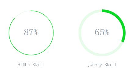
下面奉上全部源代码:
<ul class="progress">
    <!--  Item  -->
    <li data-name="HTML5 Skill" data-percent="87%">
        <svg viewBox="-10 -10 220 220">
            <g fill="none" stroke-width="2" transform="translate(100,100)">
                <path d="M 0,-100 A 100,100 0 0,1 86.6,-50" stroke="url(#cl1)"></path>
                <path d="M 86.6,-50 A 100,100 0 0,1 86.6,50" stroke="url(#cl2)"></path>
                <path d="M 86.6,50 A 100,100 0 0,1 0,100" stroke="url(#cl3)"></path>
                <path d="M 0,100 A 100,100 0 0,1 -86.6,50" stroke="url(#cl4)"></path>
                <path d="M -86.6,50 A 100,100 0 0,1 -86.6,-50" stroke="url(#cl5)"></path>
                <path d="M -86.6,-50 A 100,100 0 0,1 0,-100" stroke="url(#cl6)"></path>
            </g>
        </svg>
        <svg viewBox="-10 -10 220 220">
            <path d="M200,100 C200,44.771525 155.228475,0 100,0 C44.771525,0 0,44.771525 0,100 C0,155.228475 44.771525,200 100,200 C155.228475,200 200,155.228475 200,100 Z"
                  stroke-dashoffset="547"></path>
        </svg>
    </li>
    <!--  Item  -->
    <li data-name="jQuery Skill" data-percent="65%">
        <svg viewBox="-10 -10 220 220">
            <g fill="none" stroke-width="12" transform="translate(100,100)">
                <path d="M 0,-100 A 100,100 0 0,1 86.6,-50" stroke="url(#cl1)"></path>
                <path d="M 86.6,-50 A 100,100 0 0,1 86.6,50" stroke="url(#cl2)"></path>
                <path d="M 86.6,50 A 100,100 0 0,1 0,100" stroke="url(#cl3)"></path>
                <path d="M 0,100 A 100,100 0 0,1 -86.6,50" stroke="url(#cl4)"></path>
                <path d="M -86.6,50 A 100,100 0 0,1 -86.6,-50" stroke="url(#cl5)"></path>
                <path d="M -86.6,-50 A 100,100 0 0,1 0,-100" stroke="url(#cl6)"></path>
            </g>
        </svg>
        <svg viewBox="-10 -10 220 220">
            <path d="M200,100 C200,44.771525 155.228475,0 100,0 C44.771525,0 0,44.771525 0,100 C0,155.228475 44.771525,200 100,200 C155.228475,200 200,155.228475 200,100 Z"
                  stroke-dashoffset="200"></path>
        </svg>
    </li>
</ul>

<!--  Defining Angle Gradient Colors  -->
<svg width="0" height="0">
    <defs>
        <lineargradient id="cl1" gradientUnits="objectBoundingBox" x1="0" y1="0" x2="1" y2="1">
            <stop stop-color="#08DA24"></stop>
            <stop offset="100%" stop-color="#08DA24"></stop>
        </lineargradient>
        <lineargradient id="cl2" gradientUnits="objectBoundingBox" x1="0" y1="0" x2="0" y2="1">
            <stop stop-color="#08DA24"></stop>
            <stop offset="100%" stop-color="#08DA24"></stop>
        </lineargradient>
        <lineargradient id="cl3" gradientUnits="objectBoundingBox" x1="1" y1="0" x2="0" y2="1">
            <stop stop-color="#08DA24"></stop>
            <stop offset="100%" stop-color="#08DA24"></stop>
        </lineargradient>
        <lineargradient id="cl4" gradientUnits="objectBoundingBox" x1="1" y1="1" x2="0" y2="0">
            <stop stop-color="#08DA24"></stop>
            <stop offset="100%" stop-color="#08DA24"></stop>
        </lineargradient>
        <lineargradient id="cl5" gradientUnits="objectBoundingBox" x1="0" y1="1" x2="0" y2="0">
            <stop stop-color="#08DA24"></stop>
            <stop offset="100%" stop-color="#08DA24"></stop>
        </lineargradient>
        <lineargradient id="cl6" gradientUnits="objectBoundingBox" x1="0" y1="1" x2="1" y2="0">
            <stop stop-color="#08DA24"></stop>
            <stop offset="100%" stop-color="#08DA24"></stop>
        </lineargradient>
    </defs>
</svg>

<style>
    body {
        background-color: #fff
    }

    @-webkit-keyframes load {
        0% {
            stroke-dashoffset: 0;
        }
    }

    @keyframes load {
        0% {
            stroke-dashoffset: 0;
        }
    }

    .progress {
        position: relative;
        display: inline-block;
        padding: 0;
        text-align: center;
    }

    .progress > li {
        display: inline-block;
        position: relative;
        text-align: center;
        color: #93A2AC;
        font-family: Lato;
        font-weight: 100;
        margin: 2rem;
    }

    .progress > li:before {
        content: attr(data-name);
        position: absolute;
        width: 100%;
        bottom: -2rem;
        font-weight: 400;
    }

    .progress > li:after {
        content: attr(data-percent);
        position: absolute;
        width: 100%;
        top: 3.7rem;
        left: 0;
        font-size: 2rem;
        text-align: center;
    }

    .progress svg {
        width: 10rem;
        height: 10rem;
    }

    .progress svg:nth-child(2) {
        position: absolute;
        left: 0;
        top: 0;
        -webkit-transform: rotate(-90deg);
        transform: rotate(-90deg);
    }

    .progress svg:nth-child(2) path {
        fill: none;
        stroke-width: 25;
        stroke-dasharray: 629;
        stroke: #fff;
        opacity: .9;
        -webkit-animation: load 10s;
        animation: load 10s;
    }
</style>
拷贝一下,就可以运行了。
HTTP 服务器推送也称为 HTTP 流,是一种客户端-服务器通信模式,它将信息从 HTTP 服务器异步发送到客户端,而无需客户端请求。在高度交互的 Web 或移动应用程序中,一个或多个客户端需要连续不断地从服务器接收信息,服务器推送架构对这类应用程序特别有效。在本文中,您将了解 WebSocket 和 SSE(服务器发送的事件),它们是实现 HTTP 服务器推送的两种技术。
我首先将概述两种解决方案之间的技术差异,以及如何在 Web 架构中实现每种解决方案。我将通过一个示例应用程序,向您展示如何设置一个 SSE 实现,然后介绍一个类似的 WebSocket 实现。最后,我将比较两种技术,并提出我关于在不同类型 Web 或移动应用程序中使用它们的结论。
请注意,本文要求熟悉 HTTP 服务器推送的语言和概念。两个应用程序都是在 Python 中使用 CherryPy 编写的。
前端的HTML代码如下:
<div test-slide="{{imgs}}" data-time="3"></div>
指令testSlide代码:
.directive("testSlide", function ($interval) {
    return {
        restrict: 'A',
        replace: false,
        link: function (scope, ele, attr) {
            scope.imgs = JSON.parse(attr.testSlide);
            var time = parseFloat(attr.time);
            if (scope.imgs.length > 0 && time > 0) {
                if (typeof window.__slide === "object" && window.__slide != null) {
                    $interval.cancel(window.__slide);
                }
                window.__slide = $interval(function () {
                    var n = $(".slide>.active");
                    var c = $(".slide").children();

                    var index = -1;
                    $.each(c, function (i, n) {
                        if (i + 1 === c.length && index === -1) {
                            index = 0;
                        }
                        if ($(n).hasClass('active') === true && index === -1) {
                            index = i+1;
                        }
                    })

                    n.removeClass('active slideInRight');
                    $(c[index]).addClass('active slideInRight');

                    if(typeof c[index] === "undefined"){
                        $interval.cancel(window.__slide);
                    }
                }, time * 1000)
            }
        },
        template: '<div><style>\n' +
        '        .slide{width: 100%;}\n' +
        '        .slide .slide-img{width: 100%;display: none;}\n' +
        '        .slide .active{display: block;}\n' +
        '    </style><div class="slide">' +
        '   <div class="slide-img {{$first?\'active\':\'\'}}" ng-repeat="v in imgs">' +
        '       <img ng-src="{{v}}"/>' +
        '   </div>' +
        '</div></div>'
    }
})
功能实现了,但是可能需要增加一些动画效果,这里就懒得整了。
1.支持WebGL和canvas的浏览器 (IE10, IE11支持, 但在IE里移动图片时很卡, 不一定是全部人都有这情况)
2.Three.js (文件较大, 有官网demo, 可不下载, 下载photo-sphere-viewer.js时也有three.js)
|
1
|
下载地址:https://github.com/mrdoob/three.js |
3.photo-sphere-viewer.js (这是基于Three.js开发的柱状全景图插件)
|
1
|
下载地址:https://github.com/JeremyHeleine/Photo-Sphere-Viewer |
4.360度全景图,是左右能够完美拼接的
|
1
|
参考: 图片尺寸 3600 * 1800 (最佳尺寸) http://www.360pano.eu/show/?id=400 |
5.引入js

6.js调用
|
1
2
3
4
5
6
7
8
9
10
11
12
13
14
15
16
17
18
19
20
21
22
23
24
25
26
|
var div = document.getElementById('container');var PSV = new PhotoSphereViewer({ // Path to the panorama panorama: 'images/0398.jpg', // Container container: div, // Deactivate the animation time_anim: false, // Display the navigation bar navbar: true, // Resize the panorama size: { width: '800px', height: '400px' }, // 限制顶部 // tilt_up_max: Math.PI / 7, // 限制底部 // tilt_down_max: Math.PI / 7 }); |
7.API选择, 配置参数介绍
|
1
2
3
4
5
6
7
8
9
10
11
12
13
14
15
16
17
18
19
20
21
22
23
24
25
26
27
28
29
30
31
32
33
34
35
36
37
38
39
40
41
42
43
44
45
46
47
48
49
50
51
52
53
54
55
56
57
|
panorama:(必选)全景图的路径。container:(必选)放置全景图的容器。autoload:(默认为true)true为自动加载全景图,false为迟点加载全景图(通.过load方法)。usexmpdata:(默认值为true)photo sphere viewer是否必须读入xmp数据,false为不必须。cors_anonymous:(默认值为true)true为不能通过cookies获得用户pano_size:(默认值为null)全景图的大小,是否裁切。default_position:(默认值为0)定义默认位置,用户看见的第一个点,例如:{long: math.pi, lat: math.pi/2}。min_fov:(默认值为30)观察的最小区域,单位degrees,在1-179之间。max_fov:(默认值为90)观察的最大区域,单位degrees,在1-179之间。allow_user_interactions:(默认值为true)设置为false,则禁止用户和全景图交互(导航条不可用)。allow_scroll_to_zoom:(默认值为true)若设置为false,则用户不能通过鼠标滚动进行缩放图片。tilt_up_max:(默认值为math.pi/2)向上倾斜的最大角度,单位radians。tilt_down_max:(默认值为math.pi/2)向下倾斜的最大角度,单位radians。min_longitude:(默认值为0)能够展示的最小经度。max_longitude:(默认值为2PI)能够展示的最大维度。zoome_level:(默认值为0)默认的缩放级别,值在0-100之间。long_offset:(默认值为PI/360)mouse/touch移动时每像素经过的经度值。lat_offset:(默认值为pi/180)mouse/touch移动时每像素经过的纬度值。time_anim(默认值为2000)全景图在time_anim毫秒后会自动进行动画。(设置为false禁用它)reverse_anim:(默认值为true)当水平方向到达最大/最小的经度时,动画方向是否反转(仅仅是不能看到完整的圆)。anim_speed:(默认值为2rpm)动画每秒/分钟多少的速度。vertical_anim_speed:(默认值为2rpm)垂直方向的动画每秒/分钟多少的速度。vertical_anim_target:(默认值为0)当自动旋转时的维度,默认为赤道。navbar:(默认为false)显示导航条。navbar_style:(默认值为false)导航条的样式。有效的属性: backgroundColor:导航条背景色(默认值rgba(61, 61, 61, 0.5)); buttonsColor:按钮前景色(默认值 rgba(255, 255, 255, 0.7)); buttonBackgroundColor:按钮激活时的背景色(默认值 rgba(255, 255, 255, 0.1)); buttonsHeight:按钮高度,单位px(默认值 20); autorotateThickness:自动旋转图片的层(默认值 1); zoomRangeWidth:缩放游标的宽度,单位px(默认值 50); zoomRangeThickness:缩放游标的层(默认值 1); zoomRangeDisk:缩放游标的放大率,单位px(默认值 7); fullscreenRatio:全屏图标的比例(默认值 4/3); fullscreenThickneee:全屏图片的层,单位px(默认值 2)loading_msg:(默认值为Loading...)加载信息。loading_img:(默认值 为null)loading图片的路径。loading_html:(默认值 为null)html加载器(添加到容器中的元素或字符串)。size:(默认值为null)全景图容器的最终尺寸,例如{width: 500, height: 300}。onready:(默认值为null)全景图准备好并且第一张图片展示出来后的回调函数。方法介绍addAction():添加事件(插件没有提供执行事件的方法,似乎是提供给插件内部使用的)。fitToContainer():调整全景图容器大小为指定大小。getPosition():获取坐标经纬度。getPositionInDegrees():获取经纬度度数。getZoomLevel():获取缩放级别。load():加载全景图()。moveTo(longitude, latitude):根据经纬度移动到某一点。rotate(dlong, dlat):根据经纬度度数移动到某一点。toggleAutorotate():是否开启全景图自动旋转。toggleDeviceOrientation():是否开启重力感应方向控制。toggleFullscreen():是否开启全景图全屏。toggleStereo():是否开启立体效果(可用于WebVR哦)。zoom(level):设置缩放级别。zoomIn():放大。zoomOut():缩小。 |
示例参考:https://threejs.org/examples/#webgl_animation_cloth

近期评论