git clone git://github.com/smalot/bootstrap-datetimepicker.git
希望这个小小的项目能帮到你 !
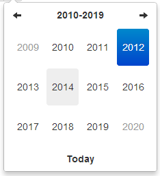
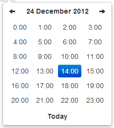
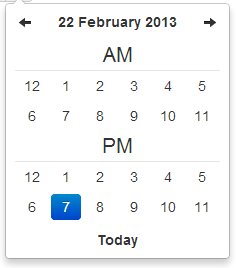
截图
十年视图
年视图
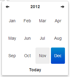
月视图

日视图*
小时视图 *

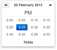
Day view w/ meridian *
Hour view w/ meridian *
依赖
需要bootstrap的下拉菜单组件 (dropdowns.less) 的某些样式,还有bootstrap的sprites (sprites.less and associated images) 中的箭头图标。
A standalone .css file (including necessary dropdown styles and alternative, text-based arrows) can be generated by running build/build_standalone.less through the lessc compiler:
$ lessc build/build_standalone.less datetimepicker.css
选项
所有需要”Date” 的选项都可以处理Date 对象; a String formatted according to the given format; or a timedelta relative to today, eg ‘-1d’, ‘+6m +1y’, etc, where valid units are ‘d’ (day), ‘w’ (week), ‘m’ (month), and ‘y’ (year).
你也可以指定一个符合 ISO-8601 格式的日期时间,就可以忽略下面的格式:
- yyyy-mm-dd
- yyyy-mm-dd hh:ii
- yyyy-mm-ddThh:ii
- yyyy-mm-dd hh:ii:ss
- yyyy-mm-ddThh:ii:ssZ
format
String. 默认值: ‘mm/dd/yyyy’
日期格式, p, P, h, hh, i, ii, s, ss, d, dd, m, mm, M, MM, yy, yyyy 的任意组合。
- p : meridian in lower case (‘am’ or ‘pm’) – according to locale file
- P : meridian in upper case (‘AM’ or ‘PM’) – according to locale file
- s : seconds without leading zeros
- ss : seconds, 2 digits with leading zeros
- i : minutes without leading zeros
- ii : minutes, 2 digits with leading zeros
- h : hour without leading zeros – 24-hour format
- hh : hour, 2 digits with leading zeros – 24-hour format
- H : hour without leading zeros – 12-hour format
- HH : hour, 2 digits with leading zeros – 12-hour format
- d : day of the month without leading zeros
- dd : day of the month, 2 digits with leading zeros
- m : numeric representation of month without leading zeros
- mm : numeric representation of the month, 2 digits with leading zeros
- M : short textual representation of a month, three letters
- MM : full textual representation of a month, such as January or March
- yy : two digit representation of a year
- yyyy : full numeric representation of a year, 4 digits
weekStart
Integer. 默认值:0
一周从哪一天开始。0(星期日)到6(星期六)
startDate
Date. 默认值:开始时间
The earliest date that may be selected; all earlier dates will be disabled.
endDate
Date. 默认值:结束时间
The latest date that may be selected; all later dates will be disabled.
daysOfWeekDisabled
String, Array. 默认值: ”, []
Days of the week that should be disabled. Values are 0 (Sunday) to 6 (Saturday). Multiple values should be comma-separated. Example: disable weekends: '0,6' or [0,6].
autoclose
Boolean. 默认值:false
当选择一个日期之后是否立即关闭此日期时间选择器。
startView
Number, String. 默认值:2, ‘month’
日期时间选择器打开之后首先显示的视图。 可接受的值:
- 0 or ‘hour’ for the hour view
- 1 or ‘day’ for the day view
- 2 or ‘month’ for month view (the default)
- 3 or ‘year’ for the 12-month overview
- 4 or ‘decade’ for the 10-year overview. Useful for date-of-birth datetimepickers.
minView
Number, String. 默认值:0, ‘hour’
日期时间选择器所能够提供的最精确的时间选择视图。
maxView
Number, String. 默认值:4, ‘decade’
日期时间选择器最高能展示的选择范围视图。
todayBtn
Boolean, “linked”. 默认值: false
如果此值为true 或 “linked”,则在日期时间选择器组件的底部显示一个 “Today” 按钮用以选择当前日期。如果是true的话,”Today” 按钮仅仅将视图转到当天的日期,如果是”linked”,当天日期将会被选中。
todayHighlight
Boolean. 默认值: false
如果为true, 高亮当前日期。
keyboardNavigation
Boolean. 默认值: true
是否允许通过方向键改变日期。
language
String. 默认值: ‘en’
The two-letter code of the language to use for month and day names. These will also be used as the input’s value (and subsequently sent to the server in the case of form submissions). Currently ships with English (‘en’), German (‘de’), Brazilian (‘br’), and Spanish (‘es’) translations, but others can be added (see I18N below). If an unknown language code is given, English will be used.
forceParse
Boolean. 默认值: true
当选择器关闭的时候,是否强制解析输入框中的值。也就是说,当用户在输入框中输入了不正确的日期,选择器将会尽量解析输入的值,并将解析后的正确值按照给定的格式format设置到输入框中。
minuteStep
Number. 默认值: 5
此数值被当做步进值用于构建小时视图。对于每个 minuteStep 都会生成一组预设时间(分钟)用于选择。
pickerReferer : 不建议使用
String. 默认值: ‘default’ (other value available : ‘input’)
The referer element to place the picker for the component implementation. If you want to place the picker just under the input field, just specify input.
pickerPosition
String. 默认值: ‘bottom-right’ (还支持 : ‘bottom-left’)
此选项当前只在组件实现中提供支持。通过设置选项可以讲选择器放倒输入框下方。
viewSelect
Number or String. 默认值: same as minView (supported values are: ‘decade’, ‘year’, ‘month’, ‘day’, ‘hour’)
With this option you can select the view from which the date will be selected. By default it’s the last one, however you can choose the first one, so at each click the date will be updated.
showMeridian
Boolean. 默认值: false
This option will enable meridian views for day and hour views.
initialDate
Date or String. 默认值: new Date()
You can initialize the viewer with a date. By default it’s now, so you can specify yesterday or today at midnight …
标记
组件模版。
<div class="input-append date" id="datetimepicker" data-date="12-02-2012" data-date-format="dd-mm-yyyy">
    <input class="span2" size="16" type="text" value="12-02-2012">
    <span class="add-on"><i class="icon-th"></i></span>
</div>
带有重置按钮(用于清空输入框)的组件模版。
<div class="input-append date" id="datetimepicker" data-date="12-02-2012" data-date-format="dd-mm-yyyy">
    <input class="span2" size="16" type="text" value="12-02-2012">
    <span class="add-on"><i class="icon-remove"></i></span>
    <span class="add-on"><i class="icon-th"></i></span>
</div>
方法
.datetimepicker(options)
初始化日期时间选择器。
remove
参数: None
移除日期时间选择器。同时移除已经绑定的event、内部绑定的对象和HTML元素。
$('#datetimepicker').datetimepicker('remove');
show
参数: None
显示日期时间选择器。
$('#datetimepicker').datetimepicker('show');
hide
参数: None
隐藏日期时间选择器。
$('#datetimepicker').datetimepicker('hide');
update
参数: None
使用当前输入框中的值更新日期时间选择器。
$('#datetimepicker').datetimepicker('update');
setStartDate
参数:
- startDate (String)
给日期时间选择器设置一个新的起始日期。
$('#datetimepicker').datetimepicker('setStartDate', '2012-01-01');
Omit startDate (or provide an otherwise falsey value) to unset the limit.
$('#datetimepicker').datetimepicker('setStartDate');
$('#datetimepicker').datetimepicker('setStartDate', null);
setEndDate
参数:
- endDate (String)
给日期时间选择器设置结束日期。
$('#datetimepicker').datetimepicker('setEndDate', '2012-01-01');
Omit endDate (or provide an otherwise falsey value) to unset the limit.
$('#datetimepicker').datetimepicker('setEndDate');
$('#datetimepicker').datetimepicker('setEndDate', null);
setDaysOfWeekDisabled
参数:
- daysOfWeekDisabled (String|Array)
Sets the days of week that should be disabled.
$('#datetimepicker').datetimepicker('setDaysOfWeekDisabled', [0,6]);
Omit daysOfWeekDisabled (or provide an otherwise falsey value) to unset the disabled days.
$('#datetimepicker').datetimepicker('setDaysOfWeekDisabled');
$('#datetimepicker').datetimepicker('setDaysOfWeekDisabled', null);
事件(Events)
Datetimepicker 类暴露了一组event用以对日期进行操作。
show
当选择器显示时被触发。
hide
当选择器隐藏时被触发。
changeDate
当日期被改变时被触发。
$('#date-end')
.datetimepicker()
.on('changeDate', function(ev){
    if (ev.date.valueOf() < date-start-display.valueOf()){
        ....
    }
});
changeYear
当十年视图上的年视图view被改变时触发。
changeMonth
当年视图上的月视图view被改变时触发。
outOfRange
当用户选择的日期超出startDate 或endDate 时,或者通过setDate 或 setUTCDate方法设置日期超出范围时被触发。
键盘支持
日期时间选择器提供了键盘导航:
up, down, left, right 方向键
这些方向键中,left/right 向后/向前 一天,up/down 向后/向前 一周。
配合shift键,up/left 向后退一个月,down/right 向前进一个月。
配置ctrl键,up/left 向后退一年,down/right 向前进一年。
Shift+ctrl 和 ctrl 同等效果 – 也就是说,他们不能同时改变月和年,只能单独改变年。
escape
escape 键可以用来隐藏、重新显示日期时间选择器;当用户希望手工编辑输入框中的值是会很有用。
enter
当选择器处于显示状态时,enter键只是将其隐藏。当选择器处于隐藏状态时,enter键发挥通常的功能 – 提交当前表单,或者其他。
I18N国际化
本插件支持月、每周中天的名称、weekStart选项的国际化。默认是语言是English (‘en’);其它可以使用的翻译文件在js/locales/ 目录中,只需在本插件之后引入需要的语言文件即可。需要增加额外语言支持的话,只需向 $.fn.datetimepicker.dates中增加一个key即可,一定要放在调用 .datetimepicker()之前。如下案例:
$.fn.datetimepicker.dates['en'] = {
    days: ["Sunday", "Monday", "Tuesday", "Wednesday", "Thursday", "Friday", "Saturday", "Sunday"],
    daysShort: ["Sun", "Mon", "Tue", "Wed", "Thu", "Fri", "Sat", "Sun"],
    daysMin: ["Su", "Mo", "Tu", "We", "Th", "Fr", "Sa", "Su"],
    months: ["January", "February", "March", "April", "May", "June", "July", "August", "September", "October", "November", "December"],
    monthsShort: ["Jan", "Feb", "Mar", "Apr", "May", "Jun", "Jul", "Aug", "Sep", "Oct", "Nov", "Dec"],
    today: "Today"
};
Right-to-left languages may also include rtl: true to make the calendar display appropriately.
If your browser (or those of your users) is displaying characters wrong, chances are the browser is loading the javascript file with a non-unicode encoding. Simply add charset="UTF-8" to your script tag:
<script type="text/javascript" src="bootstrap-datetimepicker.de.js" charset="UTF-8"></script>
使用
绑定输入框,并设置format选项:
<input type="text" value="2012-05-15 21:05" id="datetimepicker">
$('#datetimepicker').datetimepicker({
    format: 'yyyy-mm-dd hh:ii'
});
绑定输入框,并设置format标记:
<input type="text" value="2012-05-15 21:05" id="datetimepicker" data-date-format="yyyy-mm-dd hh:ii">
$('#datetimepicker').datetimepicker();
作为组件使用:
<div class="input-append date" id="datetimepicker" data-date="12-02-2012" data-date-format="dd-mm-yyyy">
    <input size="16" type="text" value="12-02-2012" readonly>
    <span class="add-on"><i class="icon-th"></i></span>
</div>
$('#datetimepicker').datetimepicker();
作为内联日期时间选择器:
<div id="datetimepicker"></div>
$('#datetimepicker').datetimepicker();


近期评论