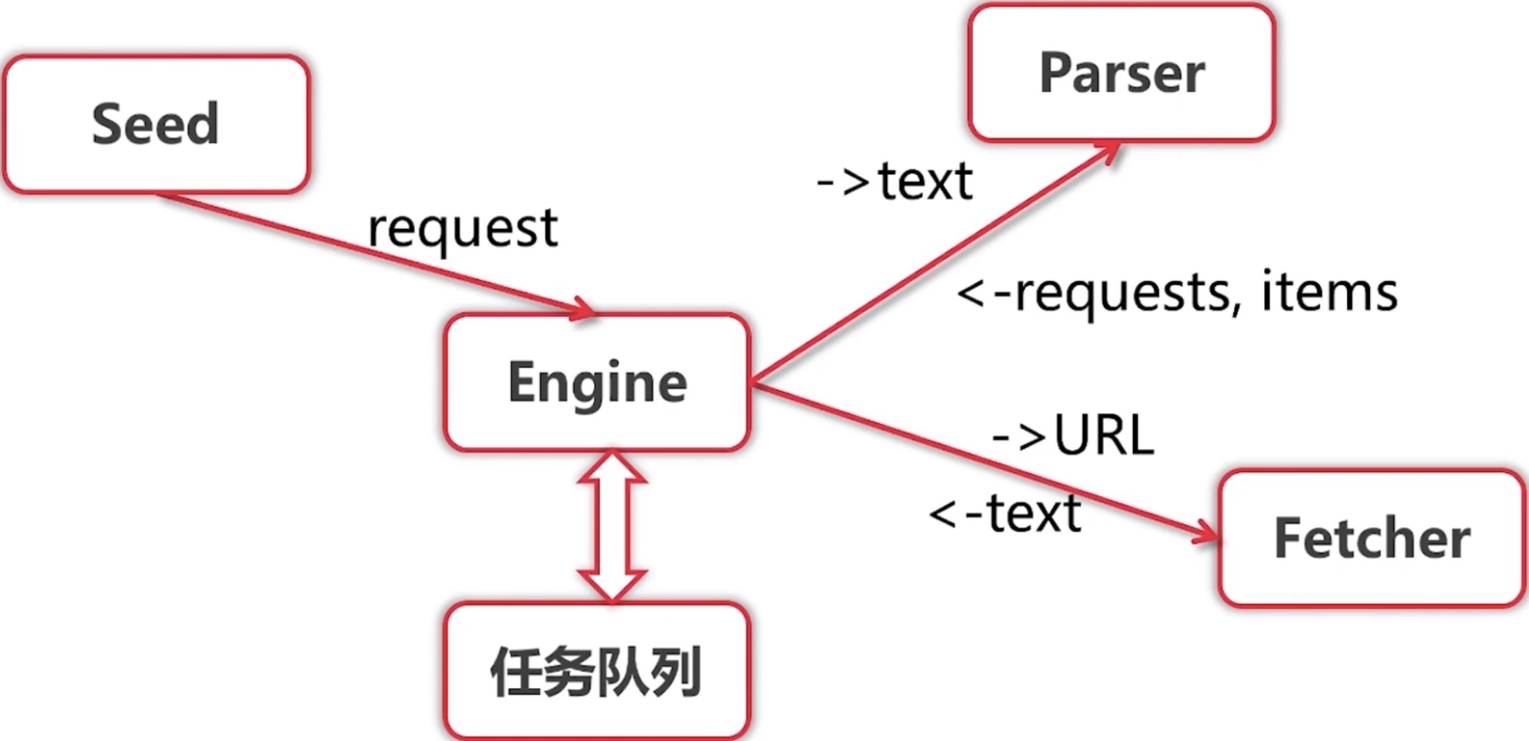
单任务版的爬虫很慢,因为只有一个 main Goroutine 在执行,最慢的地方就是爬取(fetch)和解析(parse),我们可以将同一个 url 的这两部分合并成一个任务(worker),然后使用多个 Goroutine 去并行的执行这多个 worker,这样速度就会有极大的提升。
一、并发版爬虫 – 并发调度器
1.1、架构

- 服务启动时,创建两个 chan,in(用于接收 Request)和 out(用于接收 ParseResult),并且将 in 赋值给 scheduler 的任务 chan(即 scheduler 后续操作的 chan 其实就是 in)
- 创建指定数量个 Goroutine,每一个 Goroutine 做以下几件事:
2.1. 从 in chan 中阻塞等待获取 Request
2.2. 使用 Worker 对 获取到的Request 做 fetch 和 parse 的操作,将 parseResult 阻塞发送到 out chan
- Engine 将 seeds 中的 Request 添加到调度器 chann,
- 之后开启死循环,不断从 out chan 中接收 parseResult,然后将 parseResult.items 进行打印,将 parseResult.requests 加入到 scheduler 的 chan,实际上就是 in chan(当然,
每一个 Request 加入 in 的操作都是由一个新的 Goroutine 来完成的,原因为本小节末会讲)
1.2、实现

由于项目结构进行了调整,列出发生修改的所有代码。
爬取器 fetcher 和解析器 parser 与之前相同,模型类也不变。
调度器接口 scheduler.go
package scheduler
import (
"github.com/zhaojigang/crawler/model"
)
type Scheduler interface {
Submit(request model.Request)
ConfigureMasterWorkerChan(chan model.Request)
}
并发调度器 simple.go
package scheduler
import (
"github.com/zhaojigang/crawler/model"
)
type SimpleScheduler struct {
workerChan chan model.Request
}
func (s *SimpleScheduler) ConfigureMasterWorkerChan(in chan model.Request) {
s.workerChan = in
}
func (s *SimpleScheduler) Submit(request model.Request) {
go func() { s.workerChan <- request }()
}
注意:
- 这里为每一个将 Request 添加到 chan 的任务都开启一个 Goroutine 来执行,为什么?
- 方法为何使用指针接收者而不是值接收者?
package engine
import (
"github.com/zhaojigang/crawler/fetcher"
"github.com/zhaojigang/crawler/model"
"github.com/zhaojigang/crawler/scheduler"
"log"
)
type ConcurrentEngine struct {
Scheduler scheduler.Scheduler
WorkerCount int
}
func (e ConcurrentEngine) Run(seeds ...model.Request) {
in := make(chan model.Request)
out := make(chan model.ParseResult)
e.Scheduler.ConfigureMasterWorkerChan(in)
for i := 0; i < e.WorkerCount; i++ {
createWorker(in, out);
}
for _, r := range seeds {
        e.Scheduler.Submit(r)
}
for {
result := <-out
for _, item := range result.Items {
log.Printf("getItems, items: %v", item)
}
for _, r := range result.Requests {
e.Scheduler.Submit(r)
}
}
}
func createWorker(in chan model.Request, out chan model.ParseResult) {
go func() {
for {
r := <-in
result, err := worker(r)
if err != nil {
continue
}
out <- result
}
}()
}
func worker(r model.Request) (model.ParseResult, error) {
log.Printf("fetching url:%s", r.Url)
body, err := fetcher.Fetch(r.Url)
if err != nil {
log.Printf("fetch error, url: %s, err: %v", r.Url, err)
return model.ParseResult{}, nil
}
return r.ParserFunc(body), nil
}
启动器 main.go
package main
import (
"github.com/zhaojigang/crawler/engine"
"github.com/zhaojigang/crawler/model"
"github.com/zhaojigang/crawler/scheduler"
"github.com/zhaojigang/crawler/zhenai/parser"
)
func main() {
engine.ConcurrentEngine{
Scheduler: &scheduler.SimpleScheduler{},
WorkerCount: 1000,
}.Run(model.Request{
Url: "http://www.zhenai.com/zhenghun",
ParserFunc: parser.ParseCityList,
})
}
疑问:
Q1. 为什么在 scheduler 中每一个将 Request 添加到 chan 的任务都开启一个 Go routine 来执行?
A:在 Go 语言学习9 – Channel 一节描述过,对于无缓冲的 channel,如果两个 go routine 没有同时准备好,通道会导致先执行发送或接收操作的 go routine 阻塞等待,假设使用 s.workerChan <- request 而不是 go func() { s.workerChan <- request }(),假设开启了 10 个 Worker Go routine,这 10 个 go routine 阻塞在 r := <-in 阻塞等待获取 Request 上,假设 seeds 大于 10,例如 11,那么当 Engine 的这个循环执行到底 11 个的时候,将陷入等待,因为所有的10个 Worker go routine 此时都可能也处于等待中,即 in chan 没有接收方准备好接收数据,所以 engine 作为发送方也要阻塞等待;那么为什么10个 Worker go routine 都会处于等待中呢?
for _, r := range seeds {
e.Scheduler.Submit(r)
}
go func() {
for {
r := <-in
result, err := worker(r)
if err != nil {
continue
}
out <- result
}
}()
Q2. scheduler 方法为何使用指针接收者而不是值接收者?
A:在 Go 语言学习5 – 面向接口 中我们详细的介绍了什么时候使用指针接收者,什么时候使用值接收者,其中最重要的两条就是 “1. 如果要改变接收者内部的属性值,必须使用指针接收者,因为值接收者是对接收者副本的操作;2. 如果 struct 内一个方法是指针接收者,那么其全部方法都是用指针接收者”,在 scheduler 中,我们要将外界的 in chan 赋值给 scheduler 的 workChann,所以需要改变 workChann 的值,需要使用指针接收者。
二、并发版爬虫架构 – 队列调度器
1.1、架构

服务启动时,初始化 Scheduler 的 requestChann(用于接收 Request)和 workerChan(用于接收 Worker 的 chan Request,注意:每一个 Worker 都有一个 chan Request),然后 Scheduler 启动一个 go routine,不断的将 requestChann 接收到的 Request 存储到 requestQ 切片中,将 workerChan 接收到的 chan Request 存储到 workerQ 切片中,并将 requestQ 中的 Request 分配给 workerQ 中的 chan Request(即由某一个 Worker 来处理)。
注意:在 Scheduler 中有两个 Go routine。
一个是主 Go routine,用于接收 Engine 传来的 Request 到 requestChann 以及接收 Worker 传来的 chan Request 到 workerChan 中
另一个是 Scheduler 显示启动的一个 Go routine,用于将 requestChann 接收到的 Request 存储到 requestQ 切片中,将 workerChan 接收到的 chan Request 存储到 workerQ 切片中,并将 requestQ 中的 Request 分配给 workerQ 中的 chan Request
创建指定数量个 Go routine,每一个 Go routine 做以下几件事:
- 1. 创建 Worker 自己的 w chan Request,并发送到 Scheduler 的 workerChan 中
- 2. 从 w 中阻塞等待获取 Request(如果 Scheduler 的分配 Go routine 分配了 Request 到该 Worker 的 w,则获取成功)
- 3. 使用 Worker 对 获取到的 Request 做 fetch 和 parse 的操作,将 parseResult 阻塞发送到 out chan
Engine 将 seeds 中的 Request 添加到 Scheduler 的 requestChann
之后开启死循环,不断从 out chan 中接收 parseResult,然后将 parseResult.items 进行打印,将 parseResult.requests 加入到 scheduler 的 requestChann
1.2、实现
调度器 scheduler.go
package scheduler
import (
"github.com/zhaojigang/crawler/model"
)
type Scheduler interface {
ReadyNotifier
Submit(request model.Request)
WorkerChann() chan model.Request
Run()
}
通知器 readyNotifier.go
package scheduler

import "github.com/zhaojigang/crawler/model"

type ReadyNotifier interface {
    WorkerReady(chan model.Request)
}
队列调度器 queued.go
package scheduler

import (
   "github.com/zhaojigang/crawler/model"
)

type QueuedScheduler struct {
   requestChann chan model.Request
   // 每一个Worker都有一个自己的chan Request
   // workerChan中存放的是Worker们的chan
   workerChan chan chan model.Request
}

func (s *QueuedScheduler) WorkerChann() chan model.Request {
   return make(chan model.Request)
}

func (s *QueuedScheduler) Submit(request model.Request) {
   s.requestChann <- request
}

func (s *QueuedScheduler) WorkerReady(w chan model.Request) {
   s.workerChan <- w
}

func (s *QueuedScheduler) Run() {
   // 初始化 requestChann
   s.requestChann = make(chan model.Request)
   // 初始化 workerChan
   s.workerChan = make(chan chan model.Request)

   // 创建一个 goroutine
   // 1. 进行request以及Worker的chan的存储
   // 2. 分发request到worker的chan中
   go func() {
      var requestQ []model.Request
      var workerQ []chan model.Request
      for {
         var activeRequest model.Request
         var activeWorker chan model.Request
         if len(requestQ) > 0 && len(workerQ) > 0 {
            activeRequest = requestQ[0]
            activeWorker = workerQ[0]
         }

         select {
         case r := <-s.requestChann:
            // 如果开始requestQ=nil,append之后就是包含一个r元素的切片
            requestQ = append(requestQ, r)
         case w := <-s.workerChan:
            workerQ = append(workerQ, w)
            // 进行request的分发
         case activeWorker <- activeRequest:
            requestQ = requestQ[1:]
            workerQ = workerQ[1:]
         }
      }
   }()
}
并发引擎 ConcurrentEngine.go
package engine

import (
   "github.com/zhaojigang/crawler/fetcher"
   "github.com/zhaojigang/crawler/model"
   "github.com/zhaojigang/crawler/scheduler"
   "log"
)

// 并发引擎
type ConcurrentEngine struct {
   // 调度器
   Scheduler scheduler.Scheduler
   // 开启的 worker 数量
   WorkerCount int
}

func (e ConcurrentEngine) Run(seeds ...model.Request) {
   // 初始化 Scheduler 的队列,并启动配对 goroutine
   e.Scheduler.Run()
   out := make(chan model.ParseResult)
   for i := 0; i < e.WorkerCount; i++ {
      // 每个 Worker 都创建自己的一个 chan Request
      createWorker(e.Scheduler.WorkerChann(), out, e.Scheduler);
   }
   for _, r := range seeds {
      e.Scheduler.Submit(r)
   }

   for {
      result := <-out // 阻塞获取
      for _, item := range result.Items {
         log.Printf("getItems, items: %v", item)
      }

      for _, r := range result.Requests {
         e.Scheduler.Submit(r)
      }
   }
}

func createWorker(in chan model.Request, out chan model.ParseResult, notifier scheduler.ReadyNotifier) {
   go func() {
      for {
         notifier.WorkerReady(in)
         r := <-in // 阻塞等待获取
         result, err := worker(r)
         if err != nil {
            continue
         }
         out <- result // 阻塞发送
      }
   }()
}

func worker(r model.Request) (model.ParseResult, error) {
   log.Printf("fetching url:%s", r.Url)
   body, err := fetcher.Fetch(r.Url)
   if err != nil {
      log.Printf("fetch error, url: %s, err: %v", r.Url, err)
      return model.ParseResult{}, nil
   }
   return r.ParserFunc(body), nil
}
启动器 main.go
package main
import (
"github.com/zhaojigang/crawler/engine"
"github.com/zhaojigang/crawler/model"
"github.com/zhaojigang/crawler/scheduler"
"github.com/zhaojigang/crawler/zhenai/parser"
)
func main() {
engine.ConcurrentEngine{
Scheduler: &scheduler.QueuedScheduler{},
WorkerCount: 100,
}.Run(model.Request{
Url: "http://www.zhenai.com/zhenghun",
ParserFunc: parser.ParseCityList,
})
}
队列调度器与并发调度器的对比
- 队列调度器不需要为每一个 “将 Request 添加到 chan的任务” 创建一个 Go routine 来执行
- 队列调度器需要为每一个 Worker 创建一个 chan Request
- 队列调度器编码较为复杂,并发调度器编码简单,且虽然会创建大量的
- Go routine,但是由于协程的轻量性,一般而言,问题不大

近期评论